Monday, 29 February 2016

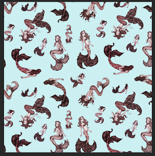
Final Wallpaper Design.

  • Overall, I am pleased with the final wallpaper design. After spending some time experimenting with compositional elements, I feel that i have learnt a lot about the process of repeating patterns, and I think the testing has paid off and i have been able to create a more refined and adaptable design than originally expected.
    - I created a couple of bedroom mock up designs using my final composition in a couple of different colour combinations. Seeing my wallpaper in this way has really helped me see how my design could successfully be appropriated onto children's bedroom walls. 


  • - liked many of the combinations but particular favourites evolve around a blue/pink/red versions of the design. These colour choices compliment the mermaid theme well - with the blue representing the sea, and the feminine touch of pink compliments the beauty of the mermaids.
  • I found using the colour wheel to refer to was a useful way of choosing colours that worked well together, - these chosen tones compliment one another and also successfully …..
  • My Ideal target audeicen of the wallpaper would be young childen, I picture it being used a bedroom perhaps. I think the light two tone colour palette appeal to this audience, without being too overbearing on other bedroom furniture or themes. I think the soft colours and simplicity to the pattern mean it would be quite and easily adaptable deisng to include in many girls bedrooms.
  • I have throughout that perhaps my deisngs could have been more playful - that other objects of scenes would have been more appealing to a young audience. But i also feel that the sophistication quality of the illustrations means the deisng could also be adapted to different locations - objects - pattern
  • as the child grows older - doesn't feel as babyish - could appeal to an older child?

  • I have found time quite limiting with this brief, and felt i haven't been able to produce as much of a final result as i would have liked. However, I feel that I've used my initiative to make the best of this situation, and use simplicity to my advantage. Initially i wanted to include other floating objects and sea themed animals surrounding the mermaids, but altering my original composition design to accommodate more negative space, has made the design interesting enough without added scenery. By playing around with scale I've been able to create a more interesting and dimensional wallpaper design, that i feel is suited to my target audience. Perhaps now the added illustrations would detract from composition. However i do feel that if i had spent more time on refining texture, that a subtle use of it as a background could be a really positive edition.
  • I also have really enjoyed working with texture in the past. if redoing the design i would also perhaps try and include the texture within the mermaids - maybe would clash with the ink?
  • taking a more simplistic to the same composition could also work well using block shapes of texture and colour could have made an interesting solution.
    The scale is something that i will definitely take into consideration on future pattern designs. In creating my mermaids, i did spend quite a lot of time adding smaller details and cleaning up edges, but in reality, when actually composed and resized, many details are lost because they are seen on a much smaller scale so perhaps less were needed. Saying that , i do feel that the details work well within the final design. In keeping the composition more simple in the final composition than planned, these details help to add more character and movement, without that level of detail i think the arrangement could have felt too empty.
  • I also feel that the style of illustration gives the wallpaper a more sophisticated quality. It will appeal to young children but perhaps not limited, - it will also appeal to teen girls.
  • from afar the mermaids aren’t perhaps instantly recognisable - the arrangement of the mermaids creates a beautiful flowing pattern which draws the eye.

Sunday, 28 February 2016

Colour tests

colour tests.

After deciding on a composition that i feel is the most successful combination of of the mermaid designs, i began experimenting with a range of colour combinations.
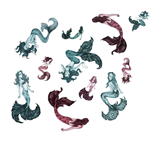
Originally i had edited the mermaids in 3 different pairs of contrasting colours. - turquoise and orange, purple and yellow, ….. although i think each work well individually, when combining together in the arrangement, i feel there are too many contrasting colours. it feels slightly overcrowded and the variety becomes too distracting. 
visually, i found that simplifying the colour palette to be much more successful. Fewer colour actually makes the imagery look bolder and more appealing, it draws the eye.

Ive still continued with the soft colour palette - light tones and colours that i feel fit with the feminine imagery and ones that i think will appeal to my target audience.
  • using a base of the lightest tone - so the background is not too heavy, and enhances the bolder illustrations instead of overpowering them.
  • note - perhaps focus down on colour - but can still work with a variety of shades for interesting depth.

  • three or more tones -
  • works well still quite strong distracting perhaps?

  • A combination of just two colours - i think it would work quite well as a final wallpaper design, however another could better enhance the imagery, and add more variety and to the pattern I've created, bringing particular details of the design to light.

three colour combinations

  • more interest than two. - still subtlety is a strong aspect. - with hints of red not over powering.
  • also helps to enhance the patterns - creating new lines for the eye to follow - the repeat of the red mermaids is particular eye catching.
  • When positioned on a wall and viewed from a distance, this extra use of colour really helps to break up the design and bring out the individual illustrations.


Saturday, 27 February 2016

Repeat pattern

wallpaper compositions and repeat patterns.
repeat patterns


Composition was something i had explored in my sketches and i have decided to simplify my design to a composition that i feel will be easily repeated and adaptable to be moved and adjusted. I don't expect to get a successful pattern straight away, so having the freedom to alter my image as i create will be a benefit.

  • leanring about repeat pattern.
  • different approaches - each individual pattern could be approached differently no right way (refer to article tips - for processes, and artist research.) - rules..
  • I've found a lot of artists work really inspiring and useful to refer to as the options of repeating i have.
- I actually enjoyed this whole process,; most of the time i was just playing around trying to achieve a composition that i felt had a nice balance of space and provided interesting shape and pattern
- I tried repeating a simple shape composition which could work but doesnt have that flow the repeat patterns that I've seen do. 

- mirroring - mirroring my pattern was a useful way of changing things up and matching sides of the imagery.
- not lining the edges up but placing the design off set. this also provided more interest and variety to the pattern.
- these methods were available to me because my image didn't have any solid edges so i was able to manipulate the convent more.

problems;
  • lining up the on each side. - might interlock quite beautifully on one side but when lining up on opposite edge - not so.
  • such thing as ‘too perfect’ found that the more i tried to line up my designs the less successful. too unifom. although it needed some sort of stucture, it could look too uniform and boring. it supposed to be fun! and playful!
  • proecss. - get one comp, copy. mirror, position half way side.
  • once repeated - kept going back to tweak individual positionings then re cloning.
  • TIP - Using guides in photoshop is a really good way of lining up each pattern repeat accurately
- i still felt the design was quite boring until i played around with scale! i found that this created a really nice balance of space and provided the image with some depth which has made a high difference. Although simple i am pleased with this composition.


- final stage 1 wallpaper - bit too blend??


New composition for repeat pattern:


Repeat Pattern Research

I have enjoyed working with pattern before, but i haven't really researched into design tips and methods of creating a repeat. I found so much inspiration that i will keep referring to throughout my compositional process!


useful video by Moud Hosny - clear and instructive.


How to transform and split up an existing illustration - useful tips from Design Sponge.


19 pattern design tips - from Digital Arts

"Learn how to create beautiful repeating patterns using your choice of Photoshop, Illustrator, pens, paints or pencils – as leading illustrators and textile designers reveal their secrets."

- Some really useful advice! i have found there are so many different approaches and methods of creating a wallpaper design. I think i need to be prepare to spend a lot of time developing compositions and arrangement  in photoshop. Many of the decisions will be made during the digital process, but its important that i have some visions of how i see my final design looking.

Friday, 19 February 2016

Edited Mermaids.

- Digitally enhancing the mermaid designs and experimenting with colour combinations.
- first method - was splitting the design into two sections - the tail and hair, and body. I then 'colorised' giving the edge a black ink a nice coloured edge.
the next test, - I created a new new masked layer set to multiply which allowed me to colour behind the lined detail. - this also allows for the lovely ink texture to show through.
- out of the two i think i prefer the second method of applying full colour and will continue to develop on all designs. I think this looks more refined and visually striking. - Which i think is impost rant considering the illustrations will be scaled down on a wall - its important that you can see them.
- I played around with contrasting colours, i liked the lighter softer tones such as light blue and red.


alteration in colour and balance can make such a different to an image, i love the softer tones. 


- I have finalised the mermaids into three different colour combinations which i all like. I feel that these may be too much if all joined together in the same composition, but this can be changed later in the design process. - i need to decide which colours are the most successful? - once they are coloured and edited this way - its easy to change the tone.