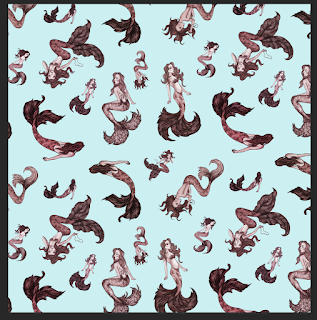
colour tests.
After deciding on a composition that i feel is the most successful combination of of the mermaid designs, i began experimenting with a range of colour combinations.
Originally i had edited the mermaids in 3 different pairs of contrasting colours. - turquoise and orange, purple and yellow, ….. although i think each work well individually, when combining together in the arrangement, i feel there are too many contrasting colours. it feels slightly overcrowded and the variety becomes too distracting.
visually, i found that simplifying the colour palette to be much more successful. Fewer colour actually makes the imagery look bolder and more appealing, it draws the eye.
Ive still continued with the soft colour palette - light tones and colours that i feel fit with the feminine imagery and ones that i think will appeal to my target audience.
- using a base of the lightest tone - so the background is not too heavy, and enhances the bolder illustrations instead of overpowering them.
- note - perhaps focus down on colour - but can still work with a variety of shades for interesting depth.
- three or more tones -
- works well still quite strong distracting perhaps?
- A combination of just two colours - i think it would work quite well as a final wallpaper design, however another could better enhance the imagery, and add more variety and to the pattern I've created, bringing particular details of the design to light.
three colour combinations
- more interest than two. - still subtlety is a strong aspect. - with hints of red not over powering.
- also helps to enhance the patterns - creating new lines for the eye to follow - the repeat of the red mermaids is particular eye catching.
- When positioned on a wall and viewed from a distance, this extra use of colour really helps to break up the design and bring out the individual illustrations.


No comments :
Post a Comment