Sunday, 30 November 2014

One week book - Screen printing.


- Preparing the screen.
- Mixing the colours - brown and green.


filling in small sections with paint - where the screen had been washed to much


Our final screen printed book.


Problems faced:
- Washing the screen after it had been exposed. We spent too long doing this, scrubbing too hard meaning that the image begun to wear away. unfortunately this meant we had to do the whole process again, but luckily, there was another screen on hand. 
- Mixing the colours in itself was easy. We had chosen a bottle green and brown - very fitting 'pub' colours we felt. however the colours on the screen would come out brighter, so we had to make sure we had enough of a contrast between the two tones to get the colours right.
- When it came to the actual printing process, it took me few goes to get the hang of it again - been a while since using screen printing. - everyone was a bit wobbly at first. it was important to use the correct technique and apply the right amount of pressure to achieve a good quality print.
- When the paint was too thick we found that some would turn out too blotchy and blury - blotting the screen and running the paint through would fix this however.
- Other screens were not pressed hard enough, and some were out of line.
- When adding the second colour, it became tricky to line up the print exact; despite using a template to align the prints - the paper we used were different sizes. - we found we just needed to measure up each print exactly to avoid this problem. 
- Despite a lot of the screens been unsuccessful, we did get a lot of good quality prints. - The good thing about screen punting is the amount you can produce - so it was an opportunity to make mistakes, practice and learn from them. By the end of the session, we each got at least a couple successful prints.

Overall this brief has been a really enjoyable learning experience. Working in a group was fun; it was interesting to share and combine ideas. Although at times it was difficult to make a joint decision, we agreed on something that everyone was happy with in the end. I feel that everyone participated and contributed something positive to the final book.
At the same time the brief challenged all of us. - just one week to create a book sounded daunting at the beginning, although it was a lot of work, i feel that we used our time efficiently and cooperated with one another, allowing us to finish on time, and create a successful end result.
I really enjoyed re-learning the screen printing process, and it is something i am interested in trying in the future. I think our print is successful - the colours turned out really well; they compliment one another. I think each of the images had a unique feel to it, but at the same time it flowed well as a book, - I think due to our good communication.


Wednesday, 26 November 2014

One Week Book - Development


- After gathering all our findings, we began to think about how this could be developed into a book. I feel that we all contributed to discussions, as well as listening to others ideas. I think we worked well as a group, and reached a joint decision.
- The pubs had a real cultural diversity, with a mix of students and locals; those who just want a quite pint. We aimed to show this mix in the book
- As we were very interested in the people, we liked the idea of different drunks you find in the pub, and also focusing on the lonely old man but having too many ideas - it became difficult to narrow down. Eventually we decided to base our book around different pub scenarios; this meant a lot of our ideas could fit into one theme. - Some based more specifically from what we'd seen through our research, and others were general stereo types.
We all discussed and planed roughs of the possible pages, before agreeing on an order. we split up the pages between us; - I was given the 'hen do' drunk. - Who we envisaged as the loud, rowdy, slightly over weight  woman, in tacky clothes. - I also contributed with the front and back pages.
- Communication within our team was really strong, and i feel that our book benefited from this. - As we all knew the direction of the book, and tone of voice - our illustrations worked well together. 
- I began developing my image - trying out different arrangements, and viewpoints. I found it difficult to draw for some reason - the proportions are a bit of; The final image isn't as refined as i would have liked, but with the limited time we had, I had to make quick decisions and go with it.
- I found separating the colours for screen print a little challenging, and created a few tests to reach a good result. I aimed to keep the detailing and shapes simple, - working primarily with block line and colour.
- Testing the two layer on acetate made it clear to see how the layers would work together.
- adding the dots in the background provided some detailing - making the woman stand out. This is also something others used within their images - tying them together. 


Visual Narratives - One week book


Our groups locations: The Packhorse pub. The Fenton pub.
First few days of the brief - observing our surroundings, becoming familiar with the locations and getting to know more about them.
- Over these few days i feel that we documented our time effectively as a group.
- I enjoyed speaking to people to gather information - at the start it seemed quite difficult to approach people, but we soon became more confident in conversing with bar staff and some locals.
- We gathered a few new facts and information about the places, and got to know the kind of people that use the pubs.
- We documented a lot of the old interior through photographs, but also through observational drawing. The pub was quite so it was mostly drawing the interior. - I found through drawing - I often noticed more interesting details about the place - from focusing on one subject long enough. - details that you wouldn't necessarily notice in a photographs. - such as the ornate fireplace coving.

Here are some of the images taken:


Observations:
- We faced a few problems. The pubs didn't open until lunch time so we felt we lost some time in the mornings. When the pubs did open, they were basically empty. - We were able to explore the interiors, but didn't get a full feel of the pub atmosphere - as we were told it could get pretty busy on an evening.
we decided to return to The Fenton on poker night which gave us more events to document, and situations to observe. i.e. conversations, and people to draw. It still wasn't as busy as we would have like but we did get a better feel of the pub. - we felt that we got to know more about the kind of locals that drink there, and an insight into the events that taken place.
- drawing people was quite challenging - it encourage me to loosen up mark making and draw quickly as they moved. - had to learn to be quick in order to capture a moment.
From visiting the pubs we were all quite interested in the people. It was interesting how these traditional pubs - some of the oldest in leeds were still so popular, but also how they attracted a diverse mix of people. - From the regular locals just wanting a quiet pint, to the young students on the lash.

Here are some examples of my observational drawings:


Monday, 17 November 2014

End of Module Evaluation

1. What practical skills and metrologies have you developed within this module and how effectively do you think you are employing these into your own practice?

- Within the module I have explored the use of new media, such as photoshop, gouache, and working with dip pens,- as well as developing my upon my existing practical skills, - working with ink and pencil. I have tried to incorporate these new skills and methods of working into the given briefs,- during the designing process. I found experimenting and working with new media to be beneficial; I discovered that I enjoyed working with gouache and so was able to incorporate this into some of my final designs, which I feel would not have been as successful without its addition.
- Through this module, I have developed my ability to formulate opinions; on my own work and on others. This has become a continuous aspect of my designing process. I believe that I am using this effectively - I evaluate my work at each stage, to decide the best way to move it forward.
- From creating initial ideas theough to the final piece, I have found blogging to be an integral part of the designing process. It is here, where I can evaluate my work at each stage in order to develop it further. Blogging has allowed me to efficiently document my progress, and help to keep my work structured and clear. - Although I feel that I need to simplify the amount of writing on my blog.

2. Which principles/theories of image making have you found most valuable during this module and how effectible do you think you are employing them into your own practice?
- During the designing process, I have found it really useful to create a selection of roughs. In visually exploring a variety of ideas and possible directions to take, I have been able to come to the best conclusions about my work. The roughs I have created for each brief, I have found extremely useful and and integral part of the designing process. 
- I have also benefitted from working in a formatted size. - Its something that I have not previous done at this early stage in the designing process, but find that considering composition at the beginning to be very useful.
- To refine an idea; I have found that repetition is key. In creating the same idea over and over again, but exploring different compositions, use of media, etc, i find that I reach a conclusion that I am happy with - I feel that I have fully exhausted an idea. Although I find this extremely valuable, I have not always shown this much development due to timing, I feel that I could use this more in my future projects.
- I have found experimentation extremely valuable. Through the development of ideas, I have found it useful to spend time testing out different media and compositions before reaching the final conclusions. At this stage, my idea of the final pieces often completely change,-testing media offers new inspiration I feel. Although I would have liked to explore media more on the first two briefs, I feel that I made the most of my time during 'Play, Play, Play' and my final outcome benefitted from this exploration.


3. What strengths can you identify within your submission and how have you capitalised on these?

- I feel I have the ability generate a range of ideas that respond well to a given brief. I try to push myself out of my comfort zone, and explore a range of possible pathways to explore before focusing solely on one idea.
- My evaluative skills. Though the module I have become more comfortable and confident in evaluating my own ideas; i find that reflecting on my work throughout the designing process allows me to make conscious decisions about how my work should develop, and the most effective way to do do. I have learnt to objectively criticise my work.
- Through the development and experimentation I have become more comfortable using a variety of media, and I have particularly found a love of working in coloured pencil. Through this module i have been able to develop and improve my skills and feel that some of the most successful aspects of my work are due the the use of coloured pencil. I will continue to explore its possible uses of application.

4. What areas for further development can you identify within your submission and how will you address these in the future?

- Within my initial two briefs, I feel that my final pieces would have benefitted if I had been more experiential with media and application. Exploring more possibility could have lead to better conclusion.
- My timing and organisation could be improved. I believe that working at a quicker pace on my roughs, and spending more time on refining and finalising my ideas, my outcomes would be more successful and of a higher standard. In future briefs i will also create a weekly timetable of tasks, and aim to meet these deadlines in order to keep up to date with all work.
- I need to learn to be more efficient in the generation of designs. although I explore a range of ideas, sometimes i don't always have time to explore each to their full potential. I feel that at times i can be too precious in the designing process and need to speed up and not focus on developing more ideas as possible. I think that developing consistency within the design process is key, I need a system that I can follow for each brief.


5. In what way has this module introduced you to the Ba (Hons) Illustration programme?

- Visual skills has introduced me to the intense workload that all continue through the rest of the course. from this i have realised that I need to plan my time more efficiently and effectively.
- The module has allowed me to see what is expected in terms of the structure and content of the course. Visual skills has been fast paced and challenging, but it has allowed me to push my abilities as an illustrator. I have become more confident in trying new things, and taking risks.
- Upon competing the visual skills module I have learnt more about what it means to be an illustrator, and feel that it has prepared me for a future as a professional.
- The module has introduced me to new methods of working and  ways of documenting my work. Ive found that uploading reflections and evaluations to the blog is a useful way to help keep work structured, clear and manageable.

Additional Notes: 
My attendance this term has suffered greatly due to unforeseen health issues. I have found it difficult to catch up, and i feel that the overall quality and quantity of my work has been affected due to these circumstances. However I am committed to the course, and motivated to achieve my full potential on further modules.

Sunday, 16 November 2014

Contextual Research


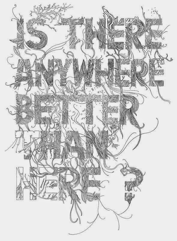
Whilst exploring type within 'Play, Play, Play i found huge inspiration and comfort within this book." 'Hand job' is a collects groundbreaking work from fifty of today's most talented typographers who draw by hand. Graphic designer and hand typographer Michael Perry selects work representing the full spectrum of design methods and styles. Each hand-drawn work is entirely shaped by the artist's unique processevery one a carefully executed composition enhanced by unplanned "accidents" of line, color, and craft."


Contextual Research - Marco Mazzoni


I am inspired by these fascinating coloured pencil drawings by Marco Mazzoni. I was instantly drawn to the beautiful soft textures and intricate detail. There is something so captivating about the surreal content and dreamy atmosphere. As I am beginning to incorporate coloured pencil into my brief, i found it exciting to see the wonderful possibilities of this media. From studying his illustrations, you can see the amount of time and skill injected into each piece. I hope to take away some of his patience; I need to not be afraid to really take time layering colours and refining marks.


Play, Play, Play, - Ideas Development and Final Outcome

After my peer feedback i am still unsure on which three designs i will be developing further, so i aim to develop a selection. i feel that because i haven't yet experienced with materials, and approaches it is perhaps difficult to see which three could most successfully work as a theme. At this stage i am also unsure on which image would fit with which title, - but i feel that all could be adaptable in some way. through the development process, I hope to be experimental and exhaustive with my materials to create a set of three successful outcomes.


- Developing 'band of colour'. i like the more simplistic interpretations.  - with less in the image to distract from the colour. i feel that the original composition works the most successfully, - with the red strip contrasting against the white background. - i do like the addition of the dog however. i developed this slightly and think the paint running down the wall works well. despite the others not being as successful found it very useful to experiment with a variation of media and approaches. i used layering paper, pastel, an watercolour/ink. i can not only see how these media work for this design, but how these could potential be applied to/work incorporated into other ideas.


'Band of stars'
- I don't like the use of coloured pen. i feel that material is too block in colour, - the way i have applied the material doesn't successfully represent the movement in the sky.
- I like the texture of the coloured pencil, but am unsure that it is the best media to use to represent the galaxy?  - need a more flowing material to interpret the blending colours and fluid shapes.
- Experimentation with water colour was interesting. at first i found it difficult to create the effect i wanted - mainly due to the paper quality - but i found that using this media in combination with sponges created some really beautiful and interesting effects - most similar to the flowing movement in the galaxy than any of the other media have achieved. if developing this idea for a final, i will continue to experiment with watercolour.
- a potential problem with this piece - i found it took me a long time to create the watercolour effect - would this be translatable to a larger scale in the time left?
- was this to represent image or image and text? - adaptable to both.

the 'wedding band'/commitment - I felt that if developing forward this image would be the most suitable to represent image and text. i applied coloured pencil and really like the textured effect it creates. i think that this would be a good material to move forward with n each of my designs.
- I experimented with gouache i found that although i prefer the pencil texture for the hand, i rather like the flat tone of gouache, and the contrast between the two.
-'until death do us part' - an appropriate accompanying piece of text in an elegant wedding font that compliments the image. - think about composition - in ribbon or underneath? -develop.


- Development of just text. i have decided to evolve my 'just text' image around a western theme. i liked the 'band of outlaws' meaning, and began to think about who to incorporate this into the text. I four this quite difficult as we were not allowed much accompanying the type. I tried incorporating objects surrounding the theme within the lettering but found it too distracting.
 - I found a fairly simple western font and adapted it slightly to make it my own - by rounding corners, and elongating letters. i really like the simple bold black lettering. i found that black gouache works well to fill with block colour.
- How to make it more western? i researched and found some old western poster designs, - all seemingly having some motif, /pattern design surrounding. i feel that this will add that missing something to the piece - make it more true to the theme?


Experimentation with watercolour and paint for the background of just text. After deciding on the band of outlaws/western theme, i wanted to create a western themed background - the kind seen associated with western posters, - using a range of brush strokes and mark making. 
- the most successful are those lightest in colour, but with freer mark making.


Experimentation of background for just type. I aimed to create a western feel in the background. i used coloured pencil in a selection of yellows and browns to do this.  began by creating wood grain effect - layering the pencil from light to dark, i think this works quite successfully but is perhaps a bit plain? I am more interested in the hatching effect. I feel that the interesting texture of the pencil is more noticeable this way, and the effect of the dark corners working to light will frame the type well. - perhaps gradually change tone more subtly on final piece. 
- I prefer the effect of coloured pencil to the watercolour - more authentic textures created.


Developing the 'band together' design. I used the same composition as my rough as i feel the design is successful.  I interpreted the hands slightly differently from reality, i used a lot of straight lines, and find the result to be quite interesting, almost cartoon like. I kept it simplistic and began to experiment with media. Like the wedding band design, i am drawn to the texture and feel of the coloured pencil, and am confident this will be a part of all my designs. although, i also like the contrast against the gouache paint background. - i am thinking of perhaps using a combination of two media.

I have enjoyed the development process and felt that it has helped me come to decide which themes have the most potential to move forward. I think i have used my time efficiently and effectively,  - experimentation and development has allowed me to reach new conclusions about my work. My choice of final images are the hands - 'band together', the wedding band/commitment, and 'band' of outlaws. i feel like other designs could have also been suitable, but these three will work well as a set i believe - they're all relatively simplistic. After experimenting with a range of possible approaches and media, my final choice is to use a combination of coloured pencil and gouache. i liked the contrast between the textured pencil, and flat gouache paint, it brings something interesting to the piece. I will use this combination throughout all designs to tie them together.


Evaluation of Final Outcome


Overall i am pleased with my three final pieces. I feel that my choice of combined media in coloured pencil and gouache has worked well to achieve the effect i wanted. the contrast between the two materials creates an interesting dynamic. - against the flat block colour the texture of the pencil becomes more prominent which i like - particularly in the 'band together' image. i took my time when layering the pencil. - building up the gradual tone this way seemed to pay off; i received positive feedback on my use of pencil and technique - i think that due to the pencil work the pieces feel well executed. although i like the use of gouache it was pointed out that in places it could have been neater, and i would agree. I found that in places the paint varied in tone when i wanted it to be flat. i aim to improve this in future i feel that its just a case of practice. To separate the pencil and flat colour i used a thick line to border the hands, although i worried this may look too harsh i think this works well against the coloured pencil, and helps to enhance.
I think that in terms of content, in response to the brief, the most successful piece are 'band together, and 'wedding vow' - these received the most positive feedback. i feel that these are more relatable, - you can form a connection with. In my opinion i think band together is the most powerful image and best representation of the word. the simple composition effectively communicates the word, and draws your attention. it also seemed to produce the most emotive response. - the idea of everyone uniting together i feel is portrayed well.
Visually i like the 'wedding vow' composition. - good use of space. i also think the pencil work has been the most successful here -  more gradual build up in tone creating an almost soft glow effect. however i feel that the text lets the piece down. it feels too crammed within the ribbon, perhaps displayed smaller or underneath would have made a more successful piece. this was due to me feeling quite rushed towards the end of the brief. Although i feel that i have managed my time more efficiently than other briefs, i still need to make more time to refine and perfect my final outcomes. other areas also feel slightly rushed - in places i struggled to control the paint and it has gone over the edges, but on a whole i think these don't effect the overall impact  of the pieces, they can still be appreciated.
Other improvements. - general feedback from my peers was that perhaps the just text image felt a little separated from the other designs, which i would agree with to some extent. I agree that the image and image and text work well together. - the media, stylising of the content, and bright colour palette all fit. on reviewing my just text image, although i like the hatching effect, this is not present in my other designs. perhaps of this shading techniques was incorporated into them they would have linked better. - the colour palette could have also been brighter? I also feel, along with my peers that perhaps i got  a bit carried away with developing the word, and it has become quite distant from its original meaning. - although i didn't want the outcomes to be obvious, i still wanted the meaning to be present in some sense, and i am unsure that people got 'band of outlaws'. However i do think i sense of mystery is good to have, - hopefully intrigue an audience to learn more; make them think, and study a piece.

Peer Feedback