Sunday, 25 January 2015

Visual Narratives - Self Evaluation


1.  Which practical skills and methodologies have you developed within this module and how effectively do you think you are employing them within your own practice?

Within this module i feel that i have developed my screen printing skills. Previously I have had little experience screen printing and struggled to remember the process. I found our induction highly useful, and was able to incorporate these newly found skills when creating our hotdog books; I feel that i can now comfortably do the process on my own. Although I have not used screen printing since, it is a process that i would very much like to incorporate into future briefs
How to produce a book. Not specifically one area - but the entire process really. I was really pleased with the overall professional quality and standard of our books; due to the inductions and guidance we had.
The indesign workshops were hugely helpful in informing us how to set up of pages. - although missing a session, I caught up in my own time. - Now I have learnt how to arrange a book on indesign, it seems so simple! i will definitely be using it again in the future;  the process is a lot more professional than what i have used in the past.


In this module i feel that i really pushed my self out of my comfort zone. i steered away from media that i have previously used, and experimented with different techniques and methods of working. Exhaustively testing media resulted in me really liking texture. after refining my skills, i decided that i would be creating the visuals of my book using shape and texture. - after some struggling in the beginning of the experimenting stage, i continued to explore the media, testing and developing my skills - problem solving until i found a style i was happy with - one that i was happy to develop into final illustrations.

2. Which approaches to research have you found most valuable during this module. How have you interrogated your research to identify appropriate ideas?

During this module, I have found taking photographs to be very valuable. I feel that because i had so many ideas of where to visit, i needed a method of documentation that was practical; taking images allowed me to capture moments quickly. When needing to look back at research for reference, I found that images were a useful, clear representation of the location. - it was easy for me to remember my feelings for the place. - got a sense of atmosphere.
I went slightly overboard on the note writing, but felt that carrying out a thorough investigation into my chosen locations  through facts was a good way for me to compare, and evaluate my research.- good to narrow down possible locations by exhausting the options - where could this develop? potential for a book? I found myself being more critical, than i had in our previous module; asking questions, and responding to these initial notes and ideas - this was then easy to refer to further down the line. I could look back and remember certain ideas for possible direction.

I have also found it was also useful to visualise my ideas. - although i feel i could have done this more, when i did, it helped me to have a clearer understanding of my thought process, - as i was able to see what physically worked and what didn't.

3. What strengths can you identify within your submission and how have you capitalised on these?

Within this brief i have pushed my abilities. I have been brave in trying something new, and although not succeeding successfully at first - i stuck with it and refined my skills.
 I think my use of texture and shape has been really successful. As a new approach, i was unsure on how successful the out come would be, but i am pleased with the final result. From our final crit feedback, I received some really positive comments about the textures i had created. I think in future i would love to continue to explore working with texture.
I think I tackled the brief effectively, investing a lot of time into the project, particularly the production process. from creating each individual piece, to the scanning and editing. but i think this time was well spent - in refining my illustrations. The photoshop editing went well. 
- have have some experience with photoshop, but never really relied on it as much as i needed to for this brief. - I think that i used photoshop effectively to compile and arrange my whole collection of images, as well as blending and refining.
Think that i have produced a good response to the brief ‘Tell an untold story’; an interesting and informative final book, that communicates what i set out to achieve.

I think that i used my research well to inform the outcome of my book - constantly referring to my initial documentation, and feedback throughout the designing process - wether that be for facts, or visuals. I feel that my final outcome is still heavily informed by that initial research, and i am pleased that i spent some much time fact finding and developing this research. - think my book is more successful for this.


4. What areas for further development can you identify within your submission and how will you address these in the future?

Time planning towards the end of the project became less structured. i got caught up in the production process, which took me a lot longer than expected. In future, I will try to plan more time around new processes as it is difficult to judge how long these will take.
- The text on my final book. Although considered in my roughs, - the text was something that i didn't really plan a lot of time to do. I prioritised the visuals which i feel i was right to do, but in future would have planned more time to consider the text. - i released if not done to a good standard, it can bring down the quality of the visuals. - adding the text towards the end of the week interfered with my timetable. - i thought it would take no time, but in the end i had to rearrange some of my images in order for the writing to work.
- In one specific image the writing is slightly difficult to read over the textures background. - if i had more time, i would improve this.
- The whole book process was a learning curve really, but i thoroughly enjoyed it. - in future, i know how long each process takes and the time needed to invest in order to create a successful book.

Going back to the research - I really wish i had planned more time to document my findings through drawing. - although working from images later on, i would have liked to have done some observational drawing location. - In future briefs, i would try to perhaps focus down my research options before heading to that location. I found that i had so may possible ideas, but not enough time to draw, I needed to move quickly to gather all the information i wanted.


5. How effectively are you making decisions about the development of your work? 
What informs these decisions? What problems have you identified and how have you solved them?

At the end of each stage, - usually week, i find myself reflecting and evaluating upon the work i have completed. looking specifically at what has worked successfully/unsuccessfully and what direction to move into next. - doing this also helps me plan ahead - and structure my time efficiently.
I find speaking to peers, and group crits have been really helpful in making decisions about the development of my work. - it gives me confidence that my work is heading in a good direction. Getting feedback from others often provided me with new ideas and possible directions. - or looking at my work in a different way.
- In producing a book - it is important that the visuals are communicating the message clearly. - having others view my book was a really good way to see how well my illustrations were communicating the message i was trying to convey. - after receiving some feedback on one of my initial story boards - that it was slightly boring, - i began to rethink and re evaluate the intent of the book. - looked back over my facts and initial research which helped me find a tone of voice. I decided that the book would be informative and factual aimed at a young audience. 

When developing my work I often found myself referring back to the initial research ideas like this, and feedback from crits. - i found this useful to see if my work was still on track, - that i was still taking my book in the right direction.

Another problem I faced was the layout of my pages. - Compositionally I wanted the ammonite to be in the same positioning on each page - to give more focus and structure to the book. - however i didn't know how to achieve this without altering/loosing some content. - how would it still be clear? Through exhausting more roughs, I had the ideas of displaying each illustration across a double page, which i feel has been a successful decision.

6. How effectively have you managed this project and organised yourself during this module? 

- When beginning this module i was determined to make an improvement on my organisational skills, despite this module being a lot more about planning our own time- not relying as much on tutors, -  i feel that they have definitely improved. I have been creating more detailed and regular timetables in which to complete my work. - setting them as almost mini deadlines, so i feel more motivated to meet them.
At times i did become slightly behind on my personal deadlines, but it sometimes couldn't be helped - unexpected time consuming processes. I think that because i was experimenting with new techniques it was difficult to judge how long some tasks would take to complete. - in future perhaps just plan around new approaches? - leave a longer amount of time.
- due to these unexpected delays, i did become slightly rushed towards the end of the project, and made some unnecessary mistakes that took up a lot of time.


- I also feel that i have been more motivated in this project - really enjoying what i
overall i am happy with the improvement - as I'm managed to meet the deadline with time to spare. I feel that i have been a lot more motivated in this project - really enjoying the work I'm producing,  unlike previous projects achieving a successful final out come that has had a lot of time invested into producing, and doesn't feel rushed.

Saturday, 24 January 2015

Final Book

Printing

In indesign, I set up two different document sizes as i was struggling to choose one. - 1: 13cm+26cm 2: 26cm+52cm.
- Having missed the indesign sessions found it confusing to begin with, but it is designed to make the process easier - and i soon felt comfortable enough when using it. I leant the skills necessary. - in future if missing a session , i would perhaps try to catch up in my own time as i felt it is something i should have been prepared to use.
- I was really pleased with the crisp quality of my print outs, as they had turned out pixalated in the studio printers. I chose a simple slightly sheened paper which gave a lovely surface finish.

Binding
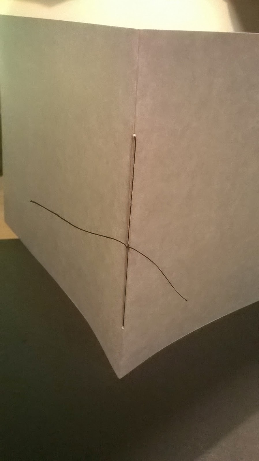
- I chose to hand bind my book - felt it would give a more authentic feel,and higher quality finsih. 
challenges: - punching holes through the spine - could go off centre.
- Practiced different techniques - chose 3 - 1cm apart.


Testing different book binding styles:
- practicing allowed me to create a good quality bind. - i was also able to decide  how i wanted the stitching to look.
The middle double page spread influence how i chose to bind; I positioned the thread in a way that avoided it crossing over an illustration - instead it blended unnoticed into the 'sea'.
- Choice of paper good - not too think - sits well when bound.


- Binding the book: - entering the string from back of the spine through the middle left the knot on the outside - something i had considered.
- making the thread tight was important in keeping the pages secure.


Final Book Pages (ordered)


Feedback from crit
Successes

- Size; I like the square dimensions of the final books; fits well with the imagery. I think both sizes are successful; the larger size would perhaps be more appealing to my target audience. The young children would appreciate the visuals more on a larger scale and be more interested in picking up the book. The writing is also clearer to read.
- Composition; Overall I am pleased with the final compositions. I spent a lot of time considering the most effective layout, and from seeing the finished book i feel that I have made the right decisions. - The ammonite shell being in the same position on each page creates a focus, and instantly grabs your attention by constantly being in the foreground.
- This also seems to make the book flow well from front to back. - it adds a simplicity to the format making each image easy to read. - your eye is drawn across the page.
- Front and back inside covers; - i wasn't sure at one point if they were the right choice to compliment the opposite pages, but i think the simplicity of the small ammonite featuring in the centre was a good design decision.
- Textures; The most popular comment form my feedback sheet was how much people loved the textures i had created. - I do think that the textures and bold colours are visually striking and capture your attention; they are one of my favourite things about the book, and something that i invested a lot of time into achieving a good quality, so I am happy to hear this seemed to pay off. 
Content:
- Its also good to hear that the book is both visually and factually engaging and appealing. 
- Although the brief states the book is intended to be a visual story, I feel that i made the right decision in including facts. I think the book flows better and makes more sense to portray the informative tone of voice I wanted.
I am glad that I narrowed the writing down. - the added text is an appropriate size to keep the book interesting but also memorable and therefore more effective; it doesn't overpower the visual aspect.
- The content featured on each page is clear, direct, and simple.


Improvements

- In some places I feel that more refining could have been done; but with limited time, there had to be a cut off point. If i did have more time to alter anything I would have:
- spend more time on the blending. - i would use the clone stamp tool at a lower opacity to create a more seamless join between layers.
- Spent more time when checking over the grammar. Unfortunately when it came to adding the writing to my book, i felt quite rushed for time. After my book was printed, i discovered a number of silly spelling mistakes.- After speaking to Kristyna I decided i would feel happier correcting this mistake, but that meant I had to go through the entire time consuming process of printing again. - Perhaps this could have been avoided if I had planned more time for adding text.
- Upon reflection the initial print out also allowed me to pick out other flaws in my work. i.e. the white writing contrasting wight the light background which I corrected.
- Direction of light - in some places could have been more believable. - spend more time editing this, making it stronger.
- The writing on second to last page - not as easy to read as the others over that particular textured background - perhaps would have altered the composition.


Wednesday, 21 January 2015

Production Process

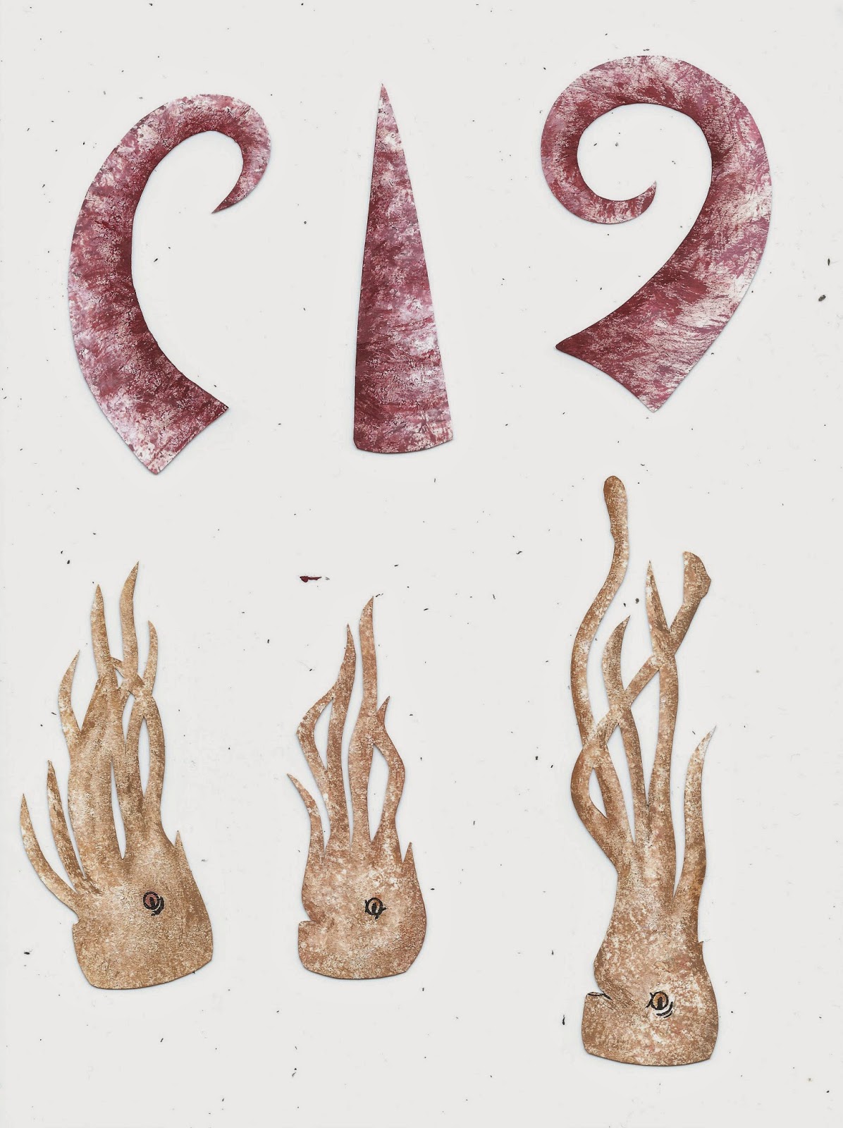
After creating a final storyboard, I planned the production of my book. - i decided that the most practical idea, was to create templates for each component. This way I can create a number of texture examples to choose from - with the template allowing me to draw out the same design again and again. - saving time and allowing me to create a variety of tests.

My final templates cut out (above). I created each piece slightly larger than needed, - allowing me to get more detail with the textures. The sizes of the pieces was not too important as i planned on resizing in photoshop.
Creating the textures.
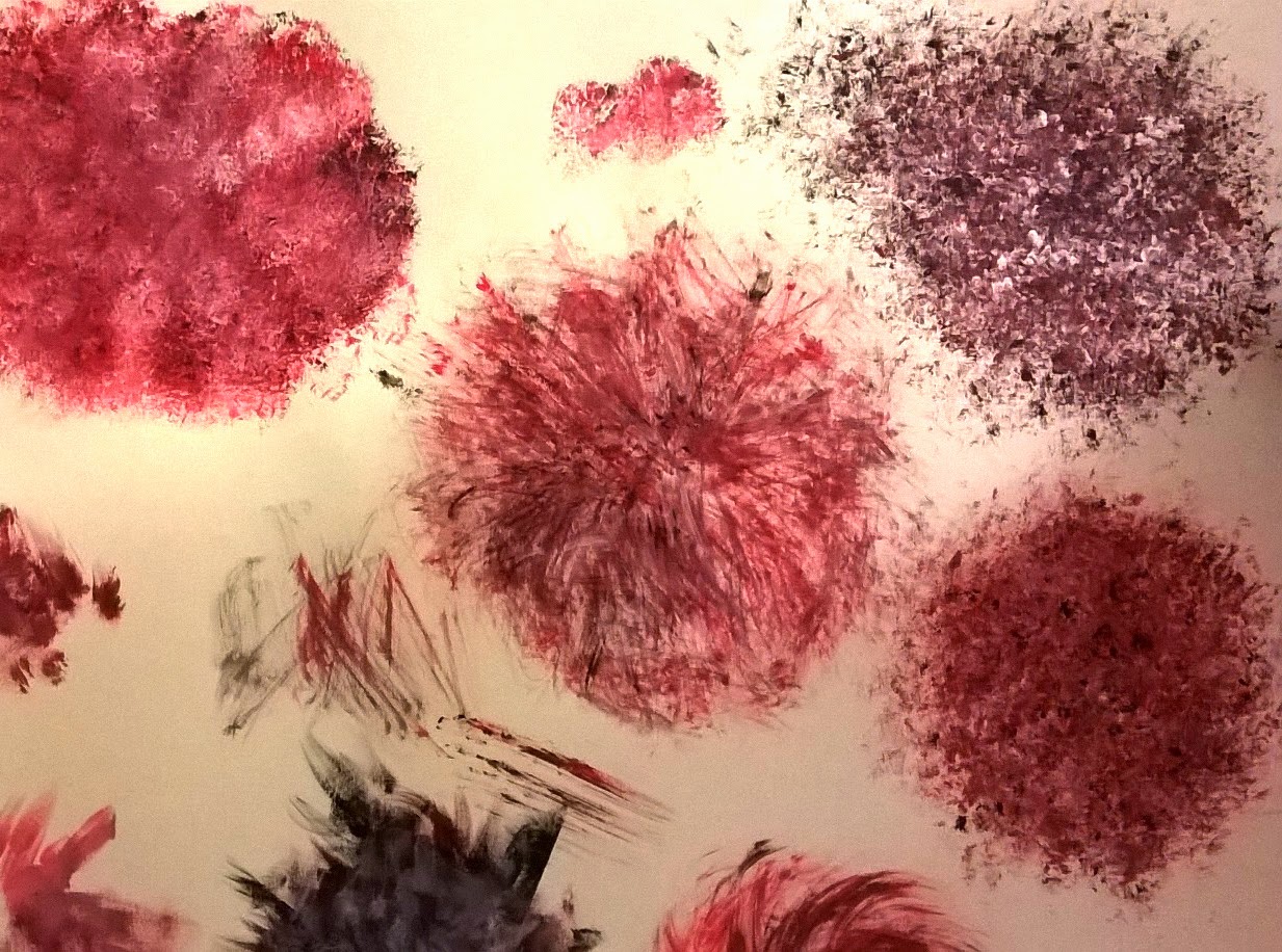
I knew what kind of textures and effects i wanted to create from previously experimenting - but this stage still required a certain amount of testing. I created a large number of possible outcomes, each varying slightly. - This gave me more choice.
At this stage i feel that i was managing my time efficiently, and being thorough with my media investigation.


Testing final against favourite background. I am really pleased with the result of this. i think the contrast of the two textures compliment each other really well. - I will use the direction of light to influence the shadows and tone of the cut outs. I will be creating more of these backgrounds to use as finals.


Application:
Most successful forms of textures so far - have been created with dry brushes, and,or, sponges.- I will be using these for my final pieces.
Brush. - Initially I found it difficult to re create some of the textures i liked from previous testing, which really frustrated me. I tried using the same quick gestural marks, but couldn't get the right effect - didn't look as delicate. Finally I solved the problem by letting paint dry on the brush. this allowed me to create the delicate, solid flick marks amongst the block faded texture. 
Sponge - 
I used the sponge more sparingly than previous. - letting more of the white show through, seemed to make the texture more prominent. i used a mix of light and dark tones layered onto one a noter creating depth and contrast. I also found the sponge created more effective textures when dryer like the brushes.

Although this was a lengthy process, I feel that it was worth investing a large amount of time in creating each piece. - these paper cuts are the basis of the whole book. - getting these to a good standard is integral to the success and quality of final outcome.


At times i just created a variety of patterns without thinking specifically about which subjects they could link to, and this meant that the colours used weren't right for the subject - for example the blue seaweed above. However I realised I didn't need to recreate them in the right colour, - i could save time and could alter the hues in photoshop.
- with some colours i.e. blues, reds, i also found i was able to create more of a contrast variety in tones so used these deliberately.


I think the sponge texture and dry brush work harmoniously together. - there is enough of a contrast that the two look different but work well sat along side each other.
It was my aim that the ammonite shell was to be the most beautiful, and detailed piece. The shell was going to be one of the main focuses of the book - appearing on each page.
- I spent more time building up layers of tone and textures,applying small detail to accentuate the spiral shape.
I am pleased with the finished shell, - it doesn't detract attention away from the other pieces, but catches your eye. I feel that it stands out as being one of the more effective pieces.
- i think the dry brush technique i used to create it has worked really successfully to describe the ammonite well. 

On each of my final pieces i spent more time building up tone. - still being careful not to go into too much detail and applying it with the same dry brush/sponge techniques. - i found this was sometimes hard to do - using these loose methods of applying media, for some details. In very small areas i used a small thinner brush. I think this has worked successfully for adding the details needed.


Editing Process

 Cutting out each of the scanned in components became a lot more time consuming than expected. - after initially using the magnetic lasso tool / lasso tool, I discovered the background eraser tool. - When set at a low tolerance level I found that this separated my image from the background more effectively, and was less time consuming. - the lasso tool was sometimes difficult to control and didn't cut precisely along my lines, - the background eraser left a smoother edge. It did however still leave the background in small areas which i used the rubber tool to remove.
- Despite it being a long process, it was one that i felt was necessary to give a more professional, quality finish to the end result./book.


Once cutting out each component to begin with, meant that arranging them into place was a lot more straight forward.  Each of my pages became filled with layers, which at times i found quite confusing. - In re naming these layers, it became a lot easier to navigate around.

Although a lot of the colours seemed dull when scanned in, altering the lighting levels and hue/saturation enhanced the tones and quality of textures. My aim was to create a bright, colourful book, so these were intensified quite highly.
Changing the hues of some colours worked well as expected. - I was easily able to select a layer, and alter the hue, adding more of a variety in colour to my images.


Blending.
After arranging the layers into a composition i was happy with, i now needed to 'blend'. This is not something i had necessarily planned for, but something that noticed needed addressing at this stage. I wasn't happy with how the paper cut layers sat together - some more than other. i.e. particually the sand. - there was just no depth to the image, and the layers didn't seem to look very natural together.
- Solving this problem. 
After experiencing with different tools, i settled on the clone stamp tool. With this i was able to select some of the sea background, and reduce it to a low opacity. -  i then used this to layer onto of the sand, gradually fading it out - making it appear as though it was disappearing into the distance.
- I also used this tool to blend the sea weed to the sand, and other edges that i felt needed softening.
The final touches to the image was adding shadow and highlights using the dodge and burn tool, - this made the positioning of subjects and lighting more believable and effective. 


Tuesday, 20 January 2015

Visual Language - 3D & Lens


For this 3D and lens task, I was instantly inspired by the work of photographer Christopher Renfro. I initially wasn't really sure how to approach the 'mutation' theme, but began to think about superpowers that i desired, - looking to childhood inspirations such as in film/comic book characters. 
I really like the striking and magical effect of these 'light orbs' - i was intrigued to leaner more about the process - although i have used long exposure before, its hard to believe this effect is captured in a single shot.


Long exposure photogrpahy; "Long-exposure photography or time-exposure photography involves using a long-duration shutter speed to sharply capture the stationary elements of images while blurring, smearing, or obscuring the moving elements." 

I began to play around with a light source using these settings, and practicing fluid movements.
I think the effect created from the light, has a really supernatural and other worldly feel, - combined with these kind of movements, it reminds me of 'light orb projection' from Code breaker - a manga comic. This is the 'mutation' i aimed to create. 


- Touch - created some nice fluid movements. but i wanted there to be more of a balance - space between the light so it appears less dense. i felt that in order to achieve what i wanted i would have to adapt/create my own light source.

- attatched a number of small led lights together. - using masking tape. After experimenting with this creation, i was a lot more pleased with the results. - more fluidity, much nicer effect.


Final piece. 
i continued to experiment with a few other light sources i'd found but none had quite the same effect. 
Composition. i wanted it to look as though i was projecting the light sources. - they needed to be floating. I knew i needed the back ground to be quite lite in order for me to be noticeable, and to create a balanced image.
- light was used to partly highlight my face so i could be noticeable.
challenges. - it was difficult to achieve exactly what i wanted because i was directing, not creating the movement. - i had to be entirely still in the exposre, and someone else moved the light source.
- to keep me in focus. - because of the long exposure, slight movement could show, it was difficult to keep totally still.


- Overall i am pleased with the final composition. - i think the lighting is balanced across the image, and - the light source i chose to use definitely creates the most effective sense of movement.
- i could have been highlighted more - to stand out against the background - perhaps a stronger touch used for this.
- i found this week really interesting. Although i think perhaps i got a little lost in the process of light painting. - in terms of responding to the brief, i don't know if i would have done the same thing again. it would have maybe been more effective to have made a prop, - done some more hand crafting. 
- however i have really enjoyed working with long exposure light photography, and have learnt some some interesting new skills this week.