In indesign, I set up two different document sizes as i was struggling to choose one. - 1: 13cm+26cm 2: 26cm+52cm.
- Having missed the indesign sessions found it confusing to begin with, but it is designed to make the process easier - and i soon felt comfortable enough when using it. I leant the skills necessary. - in future if missing a session , i would perhaps try to catch up in my own time as i felt it is something i should have been prepared to use.
- I was really pleased with the crisp quality of my print outs, as they had turned out pixalated in the studio printers. I chose a simple slightly sheened paper which gave a lovely surface finish.
Binding
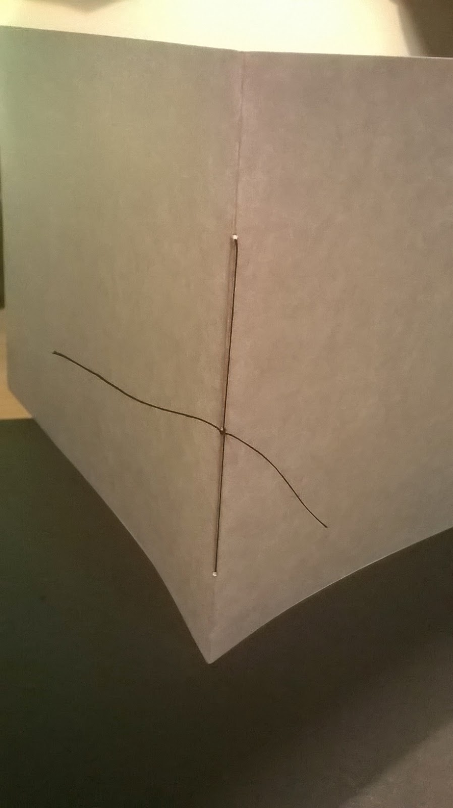
- I chose to hand bind my book - felt it would give a more authentic feel,and higher quality finsih.
challenges: - punching holes through the spine - could go off centre.
- Practiced different techniques - chose 3 - 1cm apart.
Final Book Pages (ordered)

Feedback from crit
Successes
- Size; I like the square dimensions of the final books; fits well with the imagery. I think both sizes are successful; the larger size would perhaps be more appealing to my target audience. The young children would appreciate the visuals more on a larger scale and be more interested in picking up the book. The writing is also clearer to read.
- Composition; Overall I am pleased with the final compositions. I spent a lot of time considering the most effective layout, and from seeing the finished book i feel that I have made the right decisions. - The ammonite shell being in the same position on each page creates a focus, and instantly grabs your attention by constantly being in the foreground.
- This also seems to make the book flow well from front to back. - it adds a simplicity to the format making each image easy to read. - your eye is drawn across the page.
- Front and back inside covers; - i wasn't sure at one point if they were the right choice to compliment the opposite pages, but i think the simplicity of the small ammonite featuring in the centre was a good design decision.
- Textures; The most popular comment form my feedback sheet was how much people loved the textures i had created. - I do think that the textures and bold colours are visually striking and capture your attention; they are one of my favourite things about the book, and something that i invested a lot of time into achieving a good quality, so I am happy to hear this seemed to pay off.
Content:
- Its also good to hear that the book is both visually and factually engaging and appealing.
- Although the brief states the book is intended to be a visual story, I feel that i made the right decision in including facts. I think the book flows better and makes more sense to portray the informative tone of voice I wanted.
I am glad that I narrowed the writing down. - the added text is an appropriate size to keep the book interesting but also memorable and therefore more effective; it doesn't overpower the visual aspect.
- The content featured on each page is clear, direct, and simple.
Improvements
- In some places I feel that more refining could have been done; but with limited time, there had to be a cut off point. If i did have more time to alter anything I would have:
- spend more time on the blending. - i would use the clone stamp tool at a lower opacity to create a more seamless join between layers.
- Spent more time when checking over the grammar. Unfortunately when it came to adding the writing to my book, i felt quite rushed for time. After my book was printed, i discovered a number of silly spelling mistakes.- After speaking to Kristyna I decided i would feel happier correcting this mistake, but that meant I had to go through the entire time consuming process of printing again. - Perhaps this could have been avoided if I had planned more time for adding text.
- Upon reflection the initial print out also allowed me to pick out other flaws in my work. i.e. the white writing contrasting wight the light background which I corrected.
- Direction of light - in some places could have been more believable. - spend more time editing this, making it stronger.
- The writing on second to last page - not as easy to read as the others over that particular textured background - perhaps would have altered the composition.


No comments :
Post a Comment