Wednesday, 21 January 2015

Production Process

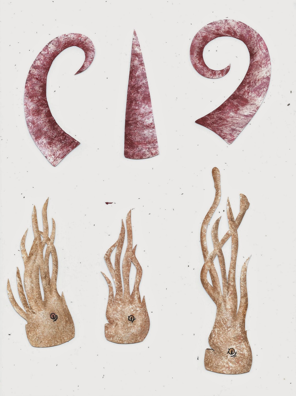
After creating a final storyboard, I planned the production of my book. - i decided that the most practical idea, was to create templates for each component. This way I can create a number of texture examples to choose from - with the template allowing me to draw out the same design again and again. - saving time and allowing me to create a variety of tests.

My final templates cut out (above). I created each piece slightly larger than needed, - allowing me to get more detail with the textures. The sizes of the pieces was not too important as i planned on resizing in photoshop.
Creating the textures.
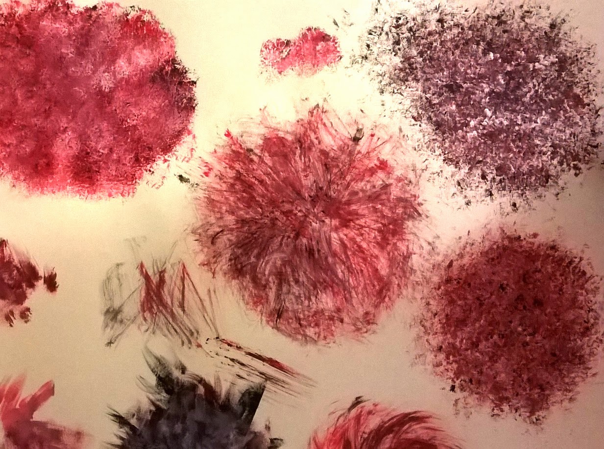
I knew what kind of textures and effects i wanted to create from previously experimenting - but this stage still required a certain amount of testing. I created a large number of possible outcomes, each varying slightly. - This gave me more choice.
At this stage i feel that i was managing my time efficiently, and being thorough with my media investigation.


Testing final against favourite background. I am really pleased with the result of this. i think the contrast of the two textures compliment each other really well. - I will use the direction of light to influence the shadows and tone of the cut outs. I will be creating more of these backgrounds to use as finals.


Application:
Most successful forms of textures so far - have been created with dry brushes, and,or, sponges.- I will be using these for my final pieces.
Brush. - Initially I found it difficult to re create some of the textures i liked from previous testing, which really frustrated me. I tried using the same quick gestural marks, but couldn't get the right effect - didn't look as delicate. Finally I solved the problem by letting paint dry on the brush. this allowed me to create the delicate, solid flick marks amongst the block faded texture. 
Sponge - 
I used the sponge more sparingly than previous. - letting more of the white show through, seemed to make the texture more prominent. i used a mix of light and dark tones layered onto one a noter creating depth and contrast. I also found the sponge created more effective textures when dryer like the brushes.

Although this was a lengthy process, I feel that it was worth investing a large amount of time in creating each piece. - these paper cuts are the basis of the whole book. - getting these to a good standard is integral to the success and quality of final outcome.


At times i just created a variety of patterns without thinking specifically about which subjects they could link to, and this meant that the colours used weren't right for the subject - for example the blue seaweed above. However I realised I didn't need to recreate them in the right colour, - i could save time and could alter the hues in photoshop.
- with some colours i.e. blues, reds, i also found i was able to create more of a contrast variety in tones so used these deliberately.


I think the sponge texture and dry brush work harmoniously together. - there is enough of a contrast that the two look different but work well sat along side each other.
It was my aim that the ammonite shell was to be the most beautiful, and detailed piece. The shell was going to be one of the main focuses of the book - appearing on each page.
- I spent more time building up layers of tone and textures,applying small detail to accentuate the spiral shape.
I am pleased with the finished shell, - it doesn't detract attention away from the other pieces, but catches your eye. I feel that it stands out as being one of the more effective pieces.
- i think the dry brush technique i used to create it has worked really successfully to describe the ammonite well. 

On each of my final pieces i spent more time building up tone. - still being careful not to go into too much detail and applying it with the same dry brush/sponge techniques. - i found this was sometimes hard to do - using these loose methods of applying media, for some details. In very small areas i used a small thinner brush. I think this has worked successfully for adding the details needed.


Editing Process

 Cutting out each of the scanned in components became a lot more time consuming than expected. - after initially using the magnetic lasso tool / lasso tool, I discovered the background eraser tool. - When set at a low tolerance level I found that this separated my image from the background more effectively, and was less time consuming. - the lasso tool was sometimes difficult to control and didn't cut precisely along my lines, - the background eraser left a smoother edge. It did however still leave the background in small areas which i used the rubber tool to remove.
- Despite it being a long process, it was one that i felt was necessary to give a more professional, quality finish to the end result./book.


Once cutting out each component to begin with, meant that arranging them into place was a lot more straight forward.  Each of my pages became filled with layers, which at times i found quite confusing. - In re naming these layers, it became a lot easier to navigate around.

Although a lot of the colours seemed dull when scanned in, altering the lighting levels and hue/saturation enhanced the tones and quality of textures. My aim was to create a bright, colourful book, so these were intensified quite highly.
Changing the hues of some colours worked well as expected. - I was easily able to select a layer, and alter the hue, adding more of a variety in colour to my images.


Blending.
After arranging the layers into a composition i was happy with, i now needed to 'blend'. This is not something i had necessarily planned for, but something that noticed needed addressing at this stage. I wasn't happy with how the paper cut layers sat together - some more than other. i.e. particually the sand. - there was just no depth to the image, and the layers didn't seem to look very natural together.
- Solving this problem. 
After experiencing with different tools, i settled on the clone stamp tool. With this i was able to select some of the sea background, and reduce it to a low opacity. -  i then used this to layer onto of the sand, gradually fading it out - making it appear as though it was disappearing into the distance.
- I also used this tool to blend the sea weed to the sand, and other edges that i felt needed softening.
The final touches to the image was adding shadow and highlights using the dodge and burn tool, - this made the positioning of subjects and lighting more believable and effective. 


No comments :

Post a Comment