Friday, 29 January 2016

Responsive - John Lewis submission & Evaluation.

https://youtu.be/FfGZRT2HucY

- My collaborative groups final submission boards for D&AD John Lewis Brief, summarising our entire design process from the start of the project to the end result.
- We wanted to keep the boards relatively simple, and aiming not to include too much text as in previous examples of what is desired, images are the priority. However we still wanted to make sure we communicate our process thoroughly so the judges can better understand our concept and ideas. We aimed to be concise and descriptive. overall i think the boards successful communicate our final resolution.


- Before today I was unsure that we had pulled enough together in response to this brief. But in seeing all of our work combined to together like this, i think we have produced a fairly substantial and strong collection.
- I think that although improvements could be made, we are all pleased with the final resolution, and feel that it successfully answers the  brief, and achieves what we set out to do. Our main concept for the design is strongly based around john lewis's ethos of being a family orientated brand. I think the way we managed to incorporate this identity, as well as showcasing the all of the stores departments will appeal to them. We aimed for our window display to attract customers of all ages by using bold design, and i think the dolls house successfully communicates they're products and in a creative and engaging way that will entice customers into the store.
- In terms of answering the briefs request for the digital age, its definitely been something that we have considered. Initially i was really inspired by all the interactive window displays on the hughstreet, and perhaps this idea of engaging a passer by on a physical level could have been pushed further, however i think our light mapping design is still an effective way capturing an audience and pushing technology. -we also submitted a video of out light mapping along with our boards to show our projecting design.


- We were really keen on keeping the design current. Having access to the future trends website really helped, and inspired our final concept of 'around the house' I feel that our concept was a successful embodiment of current design trends, and autumn themes - The fashion themes were very present within the rooms of the house - being very much inspired by and featuring john lewis furniture. Having a house as our main design means that we are able to consider autumn within the outdoors display surrounding the house.
I have really enjoyed working on this brief and having the opportunity to engage with other practitioners from the college was really nice opportunity. I got on with my group really well and it was interesting to communicate with people that work differently and specialise in different areas of design, i feel that i learn a lot

- There are aspects that i think we could have pushed a lot further however, there are things that we had failed to do when we found ourselves pushed for time towards the end. The main one being the final overall window display! this seemed to be rather overlooked until towards the end. I think people didn't necessarily see it as a priority when we were trying to create the mock up room designs and bring the house idea to its full potential. - so i feel more organisation and distributing of tasks within our group would have been appropriate.
- I Created an illustrated version of how we imagined the surrounding window display would appear which i think framed our house nicely. - but to improve, editing this illustration to include colour, it would have been a much more successful and professional looking design. It would have been nice to try and mock up some practical aspects of this design also.

Tuesday, 26 January 2016

Inside the house - room mock up design

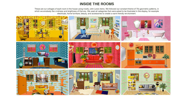
- We finally created our mock up room design for inside our house. This is an amateur example displaying how john lewis could incorporate they're furniture and interior design products into they're shop window. We hope they would take influence from our individual designs based around they're current trends.
- we mocked up this room based on some of the designs we had put together - aiming to create a cohesive fashionable living space.
- i feel that the rooms we digitally compiled were a lot more successful digitally however! the colour combinations and pattern were a lot stronger - i think a lot of this has to do with the ink.
however i think it demonstrates how the design could work in 3D
- I feel that its a shame we didn't get to explore the idea of creating flat pack furniture more - it would have been more approaporate to create illustrated versions of the furnateure that would be printed and constructed and fit well with the dolls house theme.  - or would they perhaps prefer to feature photographs of their products? - it might communicate the stores content more clearly.
- Overall i am pleased with the mock up design - i think it demonstrates how john lewis can easily incorporate they're brand - and a rough example of how they could construct it, however i do feel like better consideration of the furniture chose would have better represented out concept.


-We hired out a professional camera to photograph the scene. you can see that when photographing from the right angle you can't see the flat back of the card which is good. this is how it would really be display in the window - the designs would only ever be seen from the front so would look clean and professional.

Sunday, 24 January 2016

End of Module Evaluation.

1.  What skills have you developed through this brief and how effectively do you think you have applied them?

For me this has been the most enjoyable module on the course so far. Within which i have developed a number of skills as well as learning entirely new process. 
- My print process skills have widely developed, and expanded across different mediums. Previously i have only really experimented with screen print, and a touch of mono print, but haven't previously felt like i had the chance to explore these methods in greater detail. 
once exploring these methods i was determined to really push that process. I wanted to challenge myself - by producing a combined print of both mono and lino pure print. Mono-print is a process that i really wanted to learn more about, and have a better understanding of the process which i feel i have achieved. After much experimentation and testing I feel that these skills were utilised well, to create a set of prints that i am pleased with.
Lino print is another process which i have wanted to develop further for some time, and i have thoroughly enjoyed it. I think it was a good choice of media to use for my final prints; the aesthetic of the print has worked really well to compliment the feel of donna tarts work.
- Ive learnt to be a lot more more focused with my work this year. I feel that i've lacked confidence in my abilities and almost fear of working too far out of my comfort zone incase things go wrong. But, there was a point last year where I just felt like I wasn't really lying the work i was producing, and I've realised that need to push my work in the direction i wanted - this is up to me, to get to know the kind of work i want to create, I'm going to have to go through a lot of experimenting and trial and error. Ive got to challenge myself in order to move my practice forward, and thats something i feel i have achieved this year.

- I have become much more drawn to the print room this year.I think that i have developed and used these skills effectively, - My final safe well considered how my approaches would impact the final pieces.


2. What approaches to/methods of image making have you developed and how have they informed your concept development process?
- Again, mono print and lino, have made a huge impact on the way I've been making images, both areas that i have had extremely little- none experience using. for these processes i found myself approaching the roughs and preparation work differently than normal - adapting them to fit these specific process.
- Utilising the facilities -  printing. - allows for wider experimentation instead of sticking to the same materials and methods. I have really enjoyed sing the print room! there are a lot of things that were provided that i wouldn't have though of using for mono print - objects that helped create interesting textures.
- Alot of my experimentation came from actually printing - almost prototypes/ I have realised how useful it is having lots of tests/varietys of the final design - this is a stage i think i often usb over. - skip from roughs to final - this has just shown how valuable testing is at this stage. - i.e. even with a digital - have a few variations - of colour/compsotion,
- i had to consider both these techniques when finalising my designs. - adapted to lino - reducing the amount of depth. / detail. - more abstracts/ line based, so it really altered the visual aesthetic of my work.
- creating a print - had to be 'perfect' - I really think it made me more focused and considerate and careful about the work i was producing. - knowing that being slightly clumsy could ruin a print.
- screen print.  Adapted one of my drawings digitally which created a much more entailed screen print than i have ever created before. I really liked this affect and would definitely try it again.
- My Adobe CC skills;  - although i have used this as a method to edit and compile images in photoshop before - i have ustalised a lot more of the tools this time - making the process much more enjoyable. I was able to create a more professional finish in my opinion, by investing more time in the process - and learning a more about photoshop instead of being lazy.


4. What weaknesses can you identify in your work and how will you address these in the future?
Although I thoroughly enjoyed this module, i have found it difficult to achieve a good balance with my work. There have been times where iv'e felt really on top of things, and other times, where the amount of work seems to build up and I've felt a little overwhelmed. I don't like rushing things so i end up feeling behind. 
- I am aware that time management is something that needs to be improved. I don't want my work to suffer because of it, or missing the deadline. -as such as happened today. Its frustrating when the work is there, but it comes down to tying up loose ends is when i struggle. I think sometimes your can strive for too much.
- I feel that i don't have a problem with producing a good quantity and quality of work, but i feel that i can get easily carried away by different things that i want to try that the amount becomes too much to handle. Its better to do something properly and finish it than half heartedly.
- With this project i feel that i got so caught up in the print making process, and inverting hours in my print room - that other aspects of the project probably suffered, i.e. my blog.
- This wasn't intentional however, i did plan on balencing my time with a timetable, but the problem with trying a new process  is not quite being sure how long things are going to take. Is a lot more unpredictable. I found that mono print was a much lengthier process than originally thought. - particularly at first, but towards the end i became quicker and more confident with the process.
- Missing some crits. Its a shame that my health has affected my attendance this year, and I'm quite annoyed that i missed out on a few of the crits - especially the final one. I think its really important to gain feed back from others, and i find it really beneficial to discuss work with my peers.

3. What strengths can you identify in your work and how have/will you capitalise on these?

Throughout this brief i feel like i have really pushed my abilites and willingness to explore new processes. 
Throughout this brief i have really aimed to develop my practical approaches, and i think due to this determination, my practical skills have greatly improved. - Ive encountered quite a few difficulties along this project. - i.e. with mono print it wasn't a straight forward learning process, there was a lot of trial and error, and a lot of experimenting. Time needed to be invested in order to reach a successful final outcome, I feel that I've really pushed my self in this module, i've aimed to work at a professionally standard throughout. I feel that overall the investment has paid off, as i am happy with the final outcomes.
- In past projects I have never done so much testing and preparation for the final print. I found this to be hugely beneficial in creating these finals! it really allowed me to see the strengths of a composition/Arrangment or design, and also the weaker points. - The useful thing about mono print was the ability to alter and change. 
- The combination of mono and lino prints. This is something that i think has come out as a really strength of mine this module. Its a process that I think has helped me identify a method and style of working in which i would really like to explore and push further. Its a direction that i think could be really exciting for my practice.
- Ive constantly been reflecting on my processed and decisions throughout this module which i think has helped me reach these conclusions about my practice. 
I feel that i have finally reaching a point with my work where I'm producing the kind of images i could see myself making in the future. - I'm starting to see whats working.
- I think that i have really made good use of the longer time limit of this modeule - taken advantage of the fact that we had this opportunity to really experiment and learn a lot.
The outcomes of this brief have made me excited to try the same process again. my eyes have been opened to lino and mono print; which i know i have only just see the beginning of. I can't wait to explore these process again soon.
Overall
Reached a point with my work the brief, where i really like the aesthetic of what I'm producing. I think from all the work I have produced so far on the course, this is the imagery i am most proud of.

Presentation & Context

Considering how to present my work.
- I feel that i am not able to spend as much time on this as i would have liked due to making sure other work is finished to a good standard. However, its important that i bring all my work together in an organised form for my process to be clear.
- Decided to use bull dog clips to separate each section of work. - keeping everything separated.
- Using simple labels to title everything. - look nice.
- For my final prints, I constructed a parcel - to keep them protected. tied together with ribbon. 

- Most of my prints were all originally printed onto A2. I have cut them all down to a format of 50x50cm. Feel that this border works well on my final prints. - good balance of space.

Saturday, 23 January 2016

Final 3 Prints

As much as i love the mono print textures within my finals, i also quite like the linos printed separately. - which i haven't printed yet that have turned out of good quality.
I chose Somerset - buff paper which is of very good quality. I love the subtle colour of these and beautiful surface.
I am really please with these versions. i thought they might look too simple, but i actually think they work quite effectively stood on their own. The lino printed really well - with good pressure and no smudges. I hope to perhaps sell these prints.
- Also corrected my final hand print - created small stamps to replace the finger nails that i accidentally cut off! worked perfectly. the print now feels more complete.


- Unfortunately i made the mistake of cutting away two of the finger nails on my Lino cut! proceeding to create my final s unaware of this until after printing. I came up with the solution of simply cutting out the despaired shapes and stamping them onto my finals by hand. This worked perfectly! 


Monoprint and Lino Prints.

After Spending hours in the print room trying to achieve a perfect print, i came to the realisation that there would always be something perhaps not quite 'perfect' - but thats just the process of print. despite there being so many things that I've found can go wrong within the process of creating just one print this way - from the mono print textures being ruined by fluff and smudges getting on the paper, to the registration of the print not lining up. - For me the process was a challenge but i really feel like I've learnt a lot, and achieved more than i set out to do.


(all cropped to same dimension - couldn't get good quality scanned versions in issue to upload)


(not best quality photographs! - see final prints folder)
I chose the images that were of the best quality - what i was looking for was no smudges on the page, the ink on the print hadn't smudged. The registration of the mono print and lino, the pressure of lino print, and the quality and gradient of the mono print. - a lot to consider!!
Overall i am happy with the final 3 prints that i have chosen. Honestly they have turned out so much better than my expectations. After struggling at first for while trying to repeat the right mono print process each time, something eventually clicked during my third session, and i finally got it! from then I've spent my time in the print room developing and refining techniques which i think has really paid off. - its a process that a lot of time needed to be invested into.
The colours of mono really help bering the images to life, - its a subtle amount which keeps an element of simplicity. I wanted the black to be quite prominent, representing the eerie atmosphere of the book. - I found the colour helps to break up the image - drawing attention to the key focus of each one which was what i intended to achieve.
- The fact that it was two colour plus stock made some people feel a bit restricted. But I think that i have made good use of the mono print process by creating different gradients of black - think it provides more depth and detail.
- I think the final prints do my ideas justice, to me they successfully represent they the themes i aimed to communicate in my project proposal. - themes of transformation, /being trapped within the the landscape,/ and facing the consequences of your actions, no escape.
The landscape is the most prominent feature in all prints, - however interpreted, which also very much represents beauty. - donna tart seemed obsessed with portraying beauty - this was often found within the landscape.
I think these prints would successfully work as a wall print, or possibly be quite fitting as a book cover for the secret history. For final presentation, i will consider how i will format sizing the print. How much of a border shall i leave? want to achieve a good balance of space.

- Alteration; - originally, The second print - 'no escape' was supposed to feature characters running up the path. The decision to change this came when time was running out. I made the decision to focus on other aspects that needed finishing as I am actually pleased with the composition, despite loosing this aspect. I was worried it would takeaway something, but after discussion in the crit some people considered that it may have made the image overcomplicated - as it involves list of details already.
- perhaps it doesn't communicate the message as well as i would have hoped, but i still feel that the hand intertwined with the trees represents being trapped/no escape.

 - I have actually really enjoyed this learning process, and although very frustrating and exhausting at times, I do not regret choosing to push the process of combining mono and Lino printing. When i did achieve a very good quality print, it felt all the more special! Theres a lot more risk involved creating a print in this way however, and so i can see how its perhaps not the most time or cost effective method to choose, but the whole point of trying this process was to learn and see if its a direction i may want to take my work in. Plus, i went into this not really knowing anything about it, its taken a lot of practice and time to get my head around. - i now have a lot more confidence in my abilities with mono and lino print, and look forward to exploring it in the future!
I have come to the conlusion that i really like both process - perhaps combining the two together like this is not an everyday process, but i am definelty interested in continuing to explore both methods. I feel that my style of work has adapted really well to both of these processes.


FIINAL ANIMATION

Final from sophie kilmartin on Vimeo.

For the amount of time it takes to create, if really feels like it should last more than 15 seconds!
- Considering how much i seemed to struggle with after affects, and how little time i seemed to have left to produce that animation, I am actually really please with the way it turned out.
- everything seemed to go wrong at the very start of the process - the files not uploading properly and i begun to feel as though i would have to cut out bits of movement, but i managed to get everything included that i wanted!
- Really pleased with the visual aesthetic of my work! the textures have really brought the content to life, and i think the contrasting tones work really well together. Better than i thought it would look.

- Fortunatly, i was able to get help on starting the animation, and once the basics were explained again, i found it quite easy to pick up! The way i had created my artwork meant that i didn't have to manipulate the aesthetics of the imagery - i was able to switch between layers which were all separated in the panels bar. id managed to make things a little easier for myself.
for example the hand - the movement has already been created in my drawings so i simply positioned each layer at the time i wanted it to enter the animation and leave it. 
- for the movement of the other aspects - the people, sky and eyeball. i needed to use key frames. - once again, it became a lot less daunting.


Final touches;
- using 'easy ease' - making the movement of objects smooth - the transitions appear easier on the eye. - nice little tip i was given. - this worked particularly well on my sky.
- adding fade in at the beginning and end works well to ease in the animation - with both sound and imagery.
- the type i chose to feature the authors name and title of the book was very similar to that used on the published book cover.
- making sure that the timings were right - no bits of movement overlapping or missing.

- My favourite section of the animation, is probably when the eyeball follows the falling figure. - smooth and draws attention, to perhaps the less obvious but important movement. - when i complare the movement of the hand to the movement of people and eye, it looks a bit jittery. thats because i used the kind of stock motion way of creating movement. I really like the fluidity that after effects allows you to create. - more real. - in future i will aim to create all movement using key frames.

- The river and sky background movement help to keep the imagery flowing. - subtle but essential.
- When time was running out I was going to just move the backgrounds - but I'm so glad i didn't. The falling character and hand movement bring a bit of excitement in the middle. Really help tell the story.
- The animation depicts the event in which all the prints are centred around which really helps to link them together. I was slightly worried the fact that i didn't do it in Lino would hinder it, but it the digital looks very much like lino so i don't thinks its effected the overall quality. I have also used a similar/complementing colour palette. - lots of black tones - similar subtle colour. (- mixture of the orange and red in prints)
- perhaps some of the line work could have been better considered? - around the river for example - perhaps its not needed where the mono print could have been enough.

- I feel like the animation has turned out well, pretty much exactly how i envisaged it to look. I was so pleased with the imagery i had created for the animation i just hoped that the movement didn't let it down! i felt that the visual quality carried the image and i didn't want to overcomplicate that - My hope for the animation was to capture one of the most important events in the book - as well as my interpretations of these happenings. I aimed to keep it quite simple, but bringing to life the beautiful landscape, and peaceful surroundings. As well as the secrets the forest holds.


Animation - Adding textures.

After scanning in my initial artwork for the animation, I was slightly apprehensive as to how successfully this process would work. But once i begun adding texture, i started to come together pretty quickly. - really starting to like the way this is going, the mono print will make such a difference! 

  • Scanned in a selection of my mono printed backgrounds, before converting to black and white.
  • Using the quick selection tool to separate the texture - and merge with the drawing. - I would select the drawing layer - to get the specific set ion i wanted i.e., the face. - but then select cut, from the textures layer. Keeping each section of mono print separate and titles! - using the rubber to clean up any edges.
  • creating each hand in a separate document layer - then adjusting the positioning in the animation layer. - Found this to be difficult. some of the hands were drawn at the wrong angle and were then altered digitally - would have saved time if spent more time checking they were accurate! took a while until i was happy with all the hands.
  • to enahcne the textures i altered the levels and used the dodge and burn tools to lighten and darken certain areas. - It was important to make sure the textures used for each section are contrasting enough to stand apart from each other!
  • duplicating and repeating layers - the trees - so they can be positioned differently over each hand. - so many trees can get a little confusing! trying to rename layers to organise is useful. - also colour co-ordinating the layers was really useful!
  • Grouping the layers - allowed me to hide sections at a time - a lot easier to scroll through!
  •  It was at this moment that i realised i had formatted wrong. i had to extend each part of my animation and create new pieces which became time consuming! however luckily the composition came together in the end. - i used my Wacom tablet to tweak areas of black, and fill in the rest of the extended image.
  • I made sure that each aspect which i wanted to move is separated. Finals; 
  • the people. 
  • water - two different mono print textures to switch between,
  • sky - panning
  • eye opening
  • eyeball moving
  • hand switching between 4 positions.
  • - So when i transited my image across to after effects - each layer will be easy to move.

After effects problems;
  • after finally finishing the artwork - reaching a standard that i was happy with it was time to transfer the photoshop file across to after effects. Unfortunately this did not go quite to plan!
  • initially the file was simply the wrong size - easily corrected. but when it came to transferring the image, my separated layers would not show up. instead it was one flattened image, - despite it being this way in photoshop. With some help from my peers i was thankfully able to rectify this problem! - saving each separated file as a document, then opening that document into after effects. this process took extra time that i do not feel i have at this point! but hopefully it will be fairly easy to move forward from this pint - i c an attempt to move my separated layers - following my story board time plan.
  • I am slightly worried about the animation process, and am realising that i should have balanced my time more evenly between this and the prints, and perhaps simplified my animation. I missed after effects sessions due to being ill, and despite attending catch ups with mike, i still have struggled to understand and adapt my work to the process. More time spent practicing would have been hugely beneficial at this stage. - unexpected things always occur - like today! more time allows for error instead of last minute panic.


Elevator Pitch.

My project focuses around Donna Tartt and her infamous novel 'The secret history". I was drawn into this captivating story of murder, mystery, natures beauty and greek mythology. I've explored these themes with the combined use of Lino and mono print, to create an interesting and effective contrast of strong black ink and delicate textures.

(unfortunatly I didn't get to share this in the final crit because i was too ill to attend. After all my hard work i was actually really looking forward to sharing my work with others and getting to see how everyones final prints were coming along! shuck a shame.)


Friday, 22 January 2016

Inside the house.

- I continued to use john lewis interior trends as inspiration.


- I created my designs my hand, as we wanted to create some variety to the digital versions other member of my group were creating.
- Creaing by hand or illustrating the design might be how john lewis would choose to appropriate our design interiors, so i wanted to create something that could be used - to be printed onto templates

- initial study of john lewis furniture, and sketchbook work;


 My pinterest boards on interior design;


Developing composition;


- My finals turned out much more unfinished and rushed than originally planned, but i became more focused on making the mockup and putting that together! 
- it would have been much more appropriate if i had managed to add colour and pattern to interior, - more visually cohesive and professional. However it still gives an idea of a layout and how illustration could perhaps be used to form the templates.
- if they weren't drawing the images how would they achieve this? would john lewis use photographs of they're designs perhaps- as my other group members have when mocking up the rooms?
- I really liked when this digital versions of the rooms were brought together. They're a really cohesive collection that these hand drawn ones don't fit into. I don't regret having spent time drawing these, but perhaps worked more with shape, and spent more time creating some additional digital versions would have been more appropriate since its not a final resolution - just concept which these digital room mock ups represent quite nicely.


In considering the surroundings of the house, we haven't been good at developing our ideas. With time running out we needed to come up with a design illustrating how we want it to look. - we know we don't want to overcomplicate it, and keep it related to the autumn theme of the display.
- I created this quick drawing of how we would like to frame the house in natural surroundings, celebrating the autumn months 
- halloween pumpkins are a playful edition
- warm bonfire - family celebrations
- lots of warm colours and crunchy leaves - a crisp atmosphere.
- The trees would be attached to the panels which would layer back towards the house. We felt that also using a flat pack design - like the furniture win the rooms, would be an easy and ideal solution. This is also the opportunity to conceal lighting behind each panel to fully illuminate the scene at night!

- Its a shame we didn't get to make some of our ideas fully realised, but its really hard to focus on what to prioritise! as we wouldn't be able to do everything in the given time! the brief is also more about concept so we've got to remember they don't expect everything to be created.


other member of the team liked this display! and we plan to position out final house composition within the centre and this will positionally be included on our final boards.


Animation - Final design


  • With time moving forward so fast in this project, I have made the decision to create my imagery digitally. initially i though this would be a problem because i wanted it to be consistent with the lino print theme. however I've been encouraged that it would save time and i can made it look very similar.
  • my plan is to use the same kind of block lines that i could have used as if creating lino but draw in and scan. - i will then scan in mono print texture to place behind the different section within the composition. hopefully i will still be please with the outcome. this is a huge time saver!!
  • simplifying. - i don't want to over complicate the image with some may Lino cut lines! - reduced the information. - the sky and water are simply going to be mono print moving. - textures should provide enough detail.
  • took me  a while to develop the face - adding in the mouth! - for when hand moves.

    Digitally Compsotin my sting
  • 1
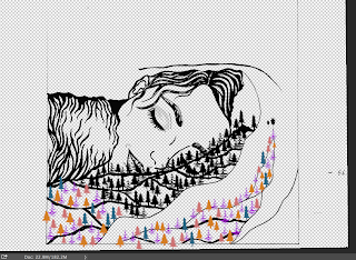
  • scanned in the body artwork - i coloured it black and strengthened the lines, whilst also removing the background.
  • time to start adding the trees! this was quite a long process. scanned in my out lines - three different ones in total. I copied an pasted each tree resizing and positioning in place until the forest floor was full. i was worried it would look too over crowded but i am pleased with the deinsity. It could get a bit confusing with al the trees so colour coding each design really helped to separate them.


Thursday, 21 January 2016

Printing process - Face

This print was a lot more straight forward than the first. - still repeating much of the same process.
- start off by inking up the board, and printing a light grey background
- once achieved a selection - begin adding colour.
chose a pinky red which i think works really well. - especially fitting with the sunset background.
- leave on face stencil to keep it grey - only sky prints pink.
- for extra dept - add a light black layer on the floor. - breaks up the image - draws your eye.

- problems. 
- bits of fluff and pieces of materials kept getting stick on my roller, which would then transfer onto the inked board and leave patches - which you would only see after a couple of reliefs! so the whole process would have to begin again.

liked the different levels - but my favourite is the slightly faded composition - not too strong - creates more texture.
- im not as happy with this as my other two - simply because of the slight smudges around the print. - at least the quality of the print is good its just a shame.


Final Print process - Hand

- Hand prints.
- Since my practice i have changed my stencils - made them look a bit more delicate and fitting with the design. a lot more successful
- decided the hand would be orange and as well as the surrounding stencils.
- feel like i know the process a lot better at this stage - although its a different print and will be approached in a different way i am still using the same techniques.

- problems
- the stencils could be very fiddly and a bit too delegate to handle with the roller at times. the hand ripped and i had to make another!
- perhaps in future look at what i could use as sturdier material.


- i feel that there is a lot of detail already in this lino cut that theres no need for lots of elaborate layering of colour. 
- i simply inked up the stencils and placed then onto the backgrounds. - making sure they're the right way round for how the lino will be printed on top! i often made this mistake.
- also had to measure on with pencil where a bouts the hand would be positioned

- i am really happy with the result. i really love the composition - despite there being no people running in this final design, i think the concept is still present - perhaps less obvious in a positive way. ' no escape.' - the empty path looks quite chilling.

- left to add - the finger nails that i cut off in lino! - i have been advised that all i needs to create some small lino stamps.


measuring up and cutting for presentation of my work.
all the prints were of different size on the paper - i want them all to be neatly sized! 
- using a scalpel was the most accurate way to do this with the resources i have!
- square format works well - keeping it in that dimension.


Wednesday, 20 January 2016

John lewis - trends.

- We have decided to continue with the them ' around the house' - we aim to showcase an array of john lewis products in a dolls house fitting within the window display.
- in order create a successful interior its important that we feel we know the brand and its products.
- i went onto the website and was inspired by a lot of their interior design! they have categories listed with different themes - such as 'coastal' 'Croft collection' - all the items within can be mixed and match and visually work well together. I think this is a lovely idea of grouping there trends for customers to be able to easier pick out a cohesive and well considered room interior. - help making shopping easier, its clear that this is a priority of theirs. Having a variety of trends also caters for a large audience.

- After ciera created the beautiful mock up of our house design, we are each creating some of the interior rooms within. I am using this website as a starting point - choosing a theme and picking out furniture to suit each room i design, to make sure its john lewis orientated, and so I'm able to hopefully create a desirable and cohesive design.