Thursday, 31 December 2015

Clock work orange - Final deigns.

Once i achieved a successful full composition, i began to further test colour combinations. The red/pink/orange design is the most successful and fitting in my opinion; i still feel the other examples work, they just perhaps don't have the same impact.


I created some mock up designs to better realise my final resolutions;


Overall i am happy with my final design, and feel that it is an appropriate solution to the brief. I think the colour palette forms a cohesive aesthetic, and suitable fits the violent and disturbing theme of the design. Simplifying the colour palette and background was definitely a good decision. The face and transitions into the background with much more ease, while the the stronger contrast of red and pinks help move draw your eye to the title text. Keeping it simple means there are less distractions and the image is much more striking and cohesive. Although i feel the composition could have been pushed further as i felt a little rushed towards the end, I am really pleased with the realisation of my concept. It is one that i feel best represents my interpretation of the book/film, and after struggling initially, I am pleased with the way i managed to encompass different emotions and ideas into one flowing image.
  • in terms of the composition - after revisiting the image, i think if re doing, i would play around with the positioning of the hands. - the one reach over his head bothers me as i don't feel that it fits as well with the flow to the others. - it kind of looks like hair?
  • i think looking closer at the text - i think the texture perhaps makes it difficult to read. Perhaps softening the texture underneath would have been a way to solve this? being in a rush to hand in was not idea, as i missed details like these.
    - There were times in the process in which i felt quite lost with the direction of the work, and a bit unsure of things. I think a lot of this has to do with me rushing into the final front cover design without a real idea of what i wanted the back cover and type to be. I should have sketched out the entire book sleeve design as a rough before editing perhaps, as i then found it difficult to create and combine all the separate elements digitally without a rough guide of the desired entire composition. 
  • - Perhaps some colour texts by hand would also have been useful? it took me a while to come up with a combination with the right balance as subtlety. although a lot of this was to do with layers and opacity.


Wednesday, 30 December 2015

Clockwork Orange - final Booksleeve

Once i achieved a successful full composition, i began to further test colour combinations. The red/pink/orange design is the most successful and fitting in my opinion; i still feel the other examples work, they just perhaps don't have the same impact.


 Final Design


Overall i am happy with my final design, and feel that it is an appropriate solution to the brief. I think the colour palette forms a cohesive aesthetic, and suitable fits the violent and disturbing theme of the design. Simplifying the colour palette and background was definitely a good decision. The face and transitions into the background with much more ease, while the the stronger contrast of red and pinks help move draw your eye to the title text. Keeping it simple means there are less distractions and the image is much more striking and cohesive. Although i feel the composition could have been pushed further as i felt a little rushed towards the end, I am really pleased with the realisation of my concept. It is one that i feel best represents my interpretation of the book/film, and after struggling initially, I am pleased with the way i managed to encompass different emotions and ideas into one flowing image.
  • in terms of the composition - after revisiting the image, i think if re doing, i would play around with the positioning of the hands. - the one reach over his head bothers me as i don't feel that it fits as well with the flow to the others. - it kind of looks like hair?
  • i think looking closer at the text - i think the texture perhaps makes it difficult to read. Perhaps softening the texture underneath would have been a way to solve this? being in a rush to hand in was not idea, as i missed details like these.
    - There were times in the process in which i felt quite lost with the direction of the work, and a bit unsure of things. I think a lot of this has to do with me rushing into the final front cover design without a real idea of what i wanted the back cover and type to be. I should have sketched out the entire book sleeve design as a rough before editing perhaps, as i then found it difficult to create and combine all the separate elements digitally without a rough guide of the desired entire composition. 

- Perhaps some colour texts by hand would also have been useful? it took me a while to come up with a combination with the right balance as subtlety. although a lot of this was to do with layers and opacity.


Group Crit - final

- At a stage where i am ready to print and just want to get on with finals!
- but quite good to have this opportunity to desicuss my plans from prints - get some more opinions on my experiments - if my plan is the right way to go - possibly any changes i should make - although its a bit late to alter the lino!
- the feedback from this session was really encouraging. the support from my peers has given me more confidence in the production of my prints. - before the session i was still unsure about continuing with mono and lino because i hadn't achieved a perfect print yet. however i was told to try because the tests i have work really effectively.
- It was suggested that instead of creating small stamps or delicate paper cut for the colour - that i simply print one of a the stencils in colour. - the general response was that the lino compositions themselves include enough detail and i don't want to overcomplicate the imagery.


Friday, 25 December 2015

Further development

Type
type is something that i hadn't really explored too much in my initial ideas. I think that working with type at an earlier stage in design process would have been beneficial; working with both at he same time would make it easier to create a cohesive flow’ between imagery and type. - as text is an important part of the brief, its integral that the two combined will make a strong composition.
I began to play around with type in photoshop over my image, trying to come up with creative solutions in linking the two together.
I decided i wanted to hand draw the type as I've been inspired my many book covers that have done this. Its a very current trend at the moment, and i feel that it can instantly make a cover instantly more interesting and unique.
I also feel that hand painted/drawn type will fit well withe the chaotic, and violent theme of the book. I aim to use the twisted flow and positioning of the arms to inspire the style of the type. It would be interesting to try and connect the fingers with the lettering almost like its been clawed.

After testing int photoshop with the paint bris, i crested a hand drawn, neater version and scanned in to colorise in the same way as my illusyrtaion.
- process; removing the background and speerating words into layers.* - using the multiply layer option to colour the lettering.
 *by this point i have so many layers - for future ref, its really useful to colour code and label appropriately!
  • rescaling and repositioning the lettering, and using the rubber and paint tool to neatern the join between type and illsurtaion for a more cohesive image.
  • Initially i worried that the type would be too small, but I am happy with the final composition, i think the type fits well with the imagery. Although not the largest book title, your eye is drawn to the text because of how its framed and sits within the surrounding illustration.
  • this worked successfully so did the same process for the aurhter name.


The spine;
  • I used the same text and adapted it to feature on the spine. I wanted to keep this simple and only included ‘The clockwork orange” and ‘Anthony Burges’. I think the bold lettering is enough to make it stand out. It also includes a snippet of the arm curling around the to the back cover.

Back cover

The back cover of the book, was also something that i hadn't considered too much in the initial designing process which would have been beneficial interred of rushing into the final cover design, but i struggle for ideas. i think editing the cover to a standard i am happy with it has provided me with more inspiration of how a back cover could evolve from this design.


  • i wanted the front cover to flow around to the back. I thought of adapting exiting elements within the front design to link the two. 
  • Drawing out the entire book sleeve dimensions helped me plan out a flowing composition. I created a new pair of extending and distorted arms, which i used to frame the cover face and move around to the back of the sleeve
  • I think these hands help to really tie the composition together on the cover. I felt it was a little empty previous to this edition, but i think it really helps to frame the face and balance out the space.
  • Mirroring the design on the back i was able to create a fluent composition that successfully frames the additional text and labels in which I needed to add onto the design.


Final Cover


Thursday, 24 December 2015

Artist Who have inspired me.

Jim Kay
- love that his works monochromes, - very eerie and creepy atmospheres created. The textures of mono print are simply beautiful and its making me really want to try this technique for myself! love the use of negative space swell - silhouettes in white - his images are very black and these areas help to break it down - create a balance. Really inspired by his work and will continue to look at his images for inspiration.
"For the illustrations in A Monster Calls, I used Monoprint, Collotype, Aquatint, Etching, and Engraving – also Nature Printing. Then I used a LOT of ink on paper, usually thrown or blown on: any old inks on any old papers. I’m not fussy with regards to materials. Some of the initial drawing was done in pencil, some in ink, some in watercolour, some in monoprint. I would then collage together marks, impressions, prints on paper, cutouts, and then create further layers and collage in Photoshop.
 This technique brings with it a lot of mistakes, so about 15% or less of the original output is seen in the book. Each image has quite a few variations. The negative illustrations are just drawings and textures inverted in Photoshop, so again very simple. It’s a case of a lot of trial and error, the technique was a new one, one which I hadn’t taken on before – so I kind of made it up as I went along. I also used bleach to distress images at times, but I wouldn’t recommend this…it gets everywhere!"
- found this really encouraging and inspiring - that its ok to make mistakes! its part of the process, and developing your practice.


Daniel Danger
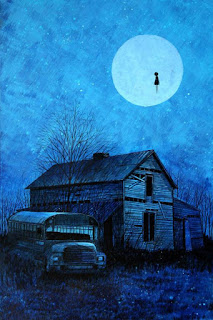
is an illustrator, image maker and printmaker. His work is so atmospheric. I love his contrast of dull and striking colour. - creates a really strong and powerful image. Theres always something quite eerie and unreal about his images - like the floating people or animals - subtle and yet intriguing - seems to become the focus on the image the more you look.
"His work attempts to remind you of something you may have said to someone, or something someone may have said to you; back in that time period thats just too far away to remember clearly, but not so long ago you forgot about it completely.Things are always changing and its easy to lose yourself."


Helen Elstone
These lino cuts are simply amazing. How they look so real i do not know. Its amazing how she has managed to capture so much detail about the people. - get a sense of their personalities through the images. Greatly admire her mark making skills. Some other lino i have looked at are very precise - use of straight lines - very calculated. I get the impression that she allows her work to be quite spontaneous.  In places it feels like she is drawing with the lino tool - I'm intrigued as to how she has made this look effortless. Pure black and white is really effective.


Reika Iwami
Iwami Reika, was a pioneer in the post-WWII male-dominated world of Japanese print-making. She is the first Japanese woman print artist “to achieve the same status and worldwide recognition as male artists.” I just love her prints. The Simplstic shape forms combined with the minimal colour really appeal to me. I think her use of minimal colour and print making techniques make her work very relevant to what I'm doing at the moment.
 "Solid, pure blacks are blended with finely textured grays and some metallic gold.  Large full moons often dominate the prints, with rocketlike golden thrusts piercing them in bold curves.  Wavelike patterns like communication symbols sometimes bisect the circles.  Sprinklings of powdered mica over the white areas give the impression of windblown sand.  In the absence of brilliant colors, form and texture are strongly evident."


 Max Angus
I discovered this artist when holidaying in ireland last summer. Her lino prints are lovely, and charming, - I like the use of a soft colour palette and minimal shapes. so simple yet so descriptive. Her images have a really calming effect, unique and beautiful way of depicting the irish landscape.
I've been looking at a lot of detailed lino cuts, and its nice to see the process being approached in a different way - more minimal - but using this to great effect - more impressive in some ways the fact that she uses little information but describes so much.

Wednesday, 23 December 2015

Animation development final - sketchbook/storyboard.


development of design.
  • In my peer review it was made clear how much it is desired for our prints and animation to have the same /ver similar visual quality to eachother. So our sting is identifiable to our prints. so at this stage i have begun thinking about how to produce the artwork.
  • My prints are created in lino and mono print. ideally i would like the sting to be the same. - however I'm finding it difficult to consider how i would get certain aspects to move if its lino? 
  • considering how i could possibly split up the artwork. - some parts lino, - the bits that are static. and other parts mono print - the sections that move.?
  • *i know you can move a certain amount in after effects, but i still am struggling to get my head around how this is achieved. To me, creating the imagery by breaking it down into separate layers is the best way for me to approach it. - by arranging separate layers in photoshop.
(imagery) - me making sense of the information. - visually trying to break down the moving parts. - how many pieces of movement would i need for each component? how many different versions? and how i could actually make something move?

  • finally planned that half would be lino back ground - still.
  • some mono print movement - which would be easy - the sky, water,
  • creating some lino print stamps would be an idea - for the walking people.
  • refining small details - people, the trees.
  • clouds - lino moving across mono print. keep clouds dense? or cut out of mono?
  • hands - drawing the different positions for turning the opposite way. - need to move like a real hand - how many stages is appropriate? - need to be same proportions!!


Tuesday, 22 December 2015

Colourising my composition

Colourising my composition. - I want the colours to be quite bold and contrasting. perhaps reds and yellows? i think they could fit well with the theme of violence and gore. Perhaps other combinations would be less obvious?

 To add colour to the design in initial removed all background from each scanned in element, before adding a new layer for the colour.
  • its important to set this layer to be set to clipping mask in order for the colour to not bleed over the edges. Choosing the option of multiply - this way the colour will feature behind the black outline i have drawn.
  • once the sections is filled, its easy testing a variety of combinations of colour.
  • Next i wanted to expeiermnt with the background. I really liked the idea of layering the image over a textured mono print to bring more depth and grit to the image. I think if just filling the elements with block colour the composition could look a little flat and boring, perhaps too clean cut for the concept i wanted to display?
  • There are so many options of colour I'm finsinf it difficult to decide at this stage! i think here the combinations are one too many. The texture is perhaps i little overpowering and the added green  means the image is a bit distracting, and not that easy to look at.


 I felt that too many colours and tones over complicate the design so i stripped back the layers. 
This is the result, and the most successful combination in my eyes.
Reducing the texture  will allow the type to become more prominent and eye-catching! it still provides enough surface detail however. reducing the colours; the face looks more fitting when the colour blends with that of the background. Using the same colour but a different shade makes the imagery much more cohesive.

- final improvement. - using the rubber too to blend the edges of the neck with the background. gives a more professional finish.


Project proposal forms

Proposal forms for final prints and animation.
- updated. - added more details and specifications.

Monday, 21 December 2015

Colour Tests

I have created some colour tests before I head in to print my final designs. - using my prototype prints  to give me a rough idea.
- already know I'm using blue for my underwater image. - quite calming and serene. - fits with idea of transformation, and a dream like state.
- the other two are more open. I didn't want to be too obvious in the colour choice - i.e. red for danger. - Thought they would work well as a bit of a mixture options; - purply red/ violet / green / orange - sunset orange. - fear, anger, danger, isolation, beauty.
- Had to consider which colours compliment each other well. - both have to work with each other and the blue.
- also considered the positioning of the colour. where a bouts does it draw the right attention? - need the right subtlety.