- interested in that eerie, bettie being the first pin up - her photographs revolutionary for the time
- also considered to be powerful, dominant.
- could the poster be inspired by a 50s magazine cover? - advertising that notorious, bettie page. - focus around portraying her as a strong powerful woman - represent what she has been to a lot of woman - an inspiration, revolutionary.
- I quite like this idea visually, - exploring the 50's style - but again, its going with the obvious - how others see bettie page - what she is famous for, I now feel confident in saying i'm defiantly more interested in exploring, and representing this darker side to her life through the poster.
Playing around with the concepts - trying to be more selective about the information. This piece is representing the two sides of Bettie - the one who loves posing for the camera, the one who is paranoid/schizophrenic. I think this has worked quite well in comparison to the overly obvious /compplex roughs - The way i approached this, I have been more considerate about the way it communicates to an audience - want to have an strong, instant impact. - not necessarily directly clear - but powerful and intriguing.
- Created with coloured pencil - but inspired by the pop art work of Andy Wrhol. - perhaps could develop digitally? - in illustrator? use of block colour, and shape. however i feel quite restricted - and think the expressive mark making is maybe more appropriate for the kind of message i am trying to communicate. - I think that the amount of energy and emotion captured in demsteaders work simpley through mark making is really inspiring.
- Created with coloured pencil - but inspired by the pop art work of Andy Wrhol. - perhaps could develop digitally? - in illustrator? use of block colour, and shape. however i feel quite restricted - and think the expressive mark making is maybe more appropriate for the kind of message i am trying to communicate. - I think that the amount of energy and emotion captured in demsteaders work simpley through mark making is really inspiring.
- Realised that i like these simple compositions. - Prefer her as an isolated image, rather than being places in front of a busy background. - more striking. I don't want to over complicate the message, - want it to be bold, - no need for additional information, - it will be strong enough to stand on its own.
- Working with paint:
- Continuing with the demsteader style, but incorporating paint. - as a media choice this has been really successful, - creating dramatic contrast between tone - using dry brush to create expressive marks, however, i think I've let the method of application restrict my marks - too uniform. - using too small, too controlled brush marks.
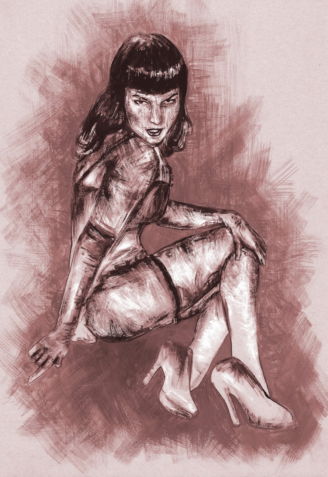
- Think this has been my most successful.(Below) - the use of larger brushes has allowed me to loosen up - forcing me to create bolder more confident brush strokes.
- I still used the photograph as reference for areas of light and dark, but added much more of my own influence to this piece.
- I like how effectively the brush strokes describe her figure - the strong contrast of light and dark really helps to accentuate her body.
- lovely composition - a subtle sense of vulnerability. The simple colour palette of black and white - as used in demsteaders work, helps to convey her emotion, - this darker more powerless side of her profession.
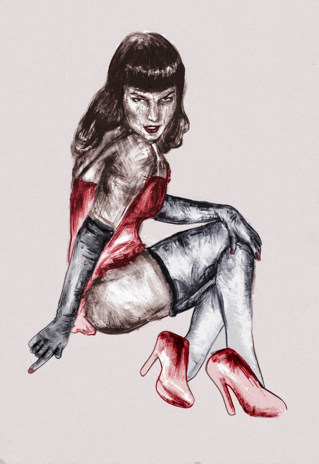
-Scanning in this painting to photoshop. - Really helpful. Not just enhancing the contrast, but experimenting with colour- resulted in some really lovely combinations.
- Digital - given the painting a more professional, finalised look. - yet the raw quality of the paint work is still present. will defiantly consider this for final. How could i incorporate digital further? combining textures/pattern perhaps?
- people were really positive in my experiments in todays feedback session. - suggestions to move forward with my idea about tying together different themes, considering other aspects that could be included in each piece rather than expression being purply through mark making.
- need to move forward with planning roughs for the postcards, and stamps - think about the final themes.


No comments :
Post a Comment