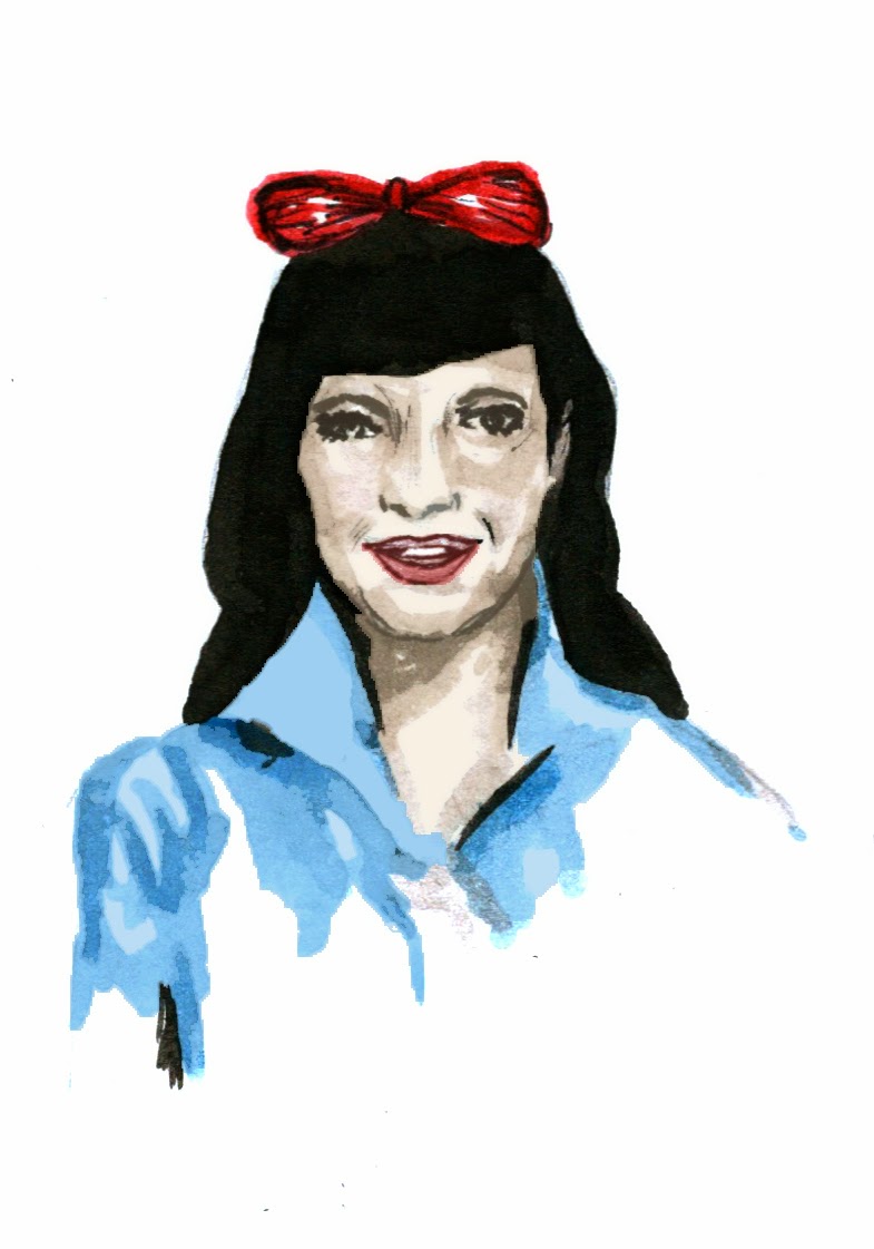
- developing on initial close ups. - this idea - showing the transition of bettie page. - from her more innocent self - on first arriving new york, through to her bondage days. - graduation of her becoming more provocative.
-Definetly not clear enough in examples i have - the poses could be stronger. - perhaps testing in the same media would have helped.
- used combinations of ink and pencil - enjoyed manipulating these on photoshop.
- Cropped examples of previous painting: - what areas of the body represent bettie page? what pose/objects. - zoomed in more effective.
- cropping in on the frame - facial expression? body? - slowly revealing more flesh.
- Could have pushed the concept further - from good, to provocative, to born again christian - shown progressive journey.
- briefly testing media - thinking about how i want these to look visually, -think i would like to use a different media for this small scale. - quick digital tests - inspired by andy Warhol.
- I scanned in an outline to photoshop filling in in blok colour, - i really like the simplicity of this effect. - colour tests effective combinations.
- I felt quite pushed for time to complete these stamps, but do wish i had spent more time developing them in the style of andy Warhols work. - using more interesting, strong colour combinations. - editing digitally perhaps illustrator - creating more layers and detail.
- come to realise that i do want the media to be simplified for the stamps- less detail in these small frames will work better. - not overcomplicate the space.


No comments :
Post a Comment